Intro to Graphic Design Software I
Projects
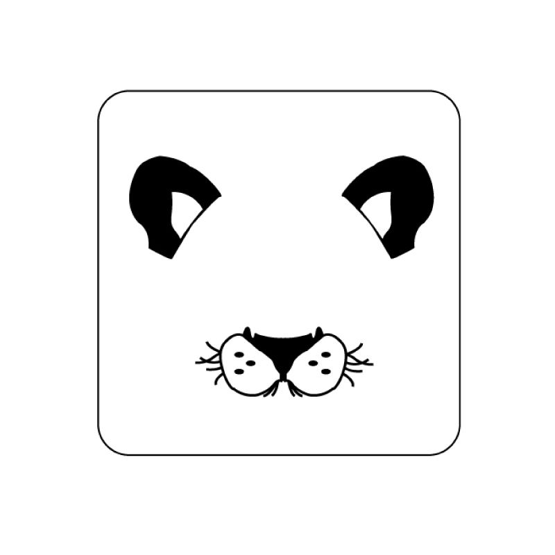
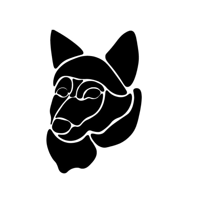
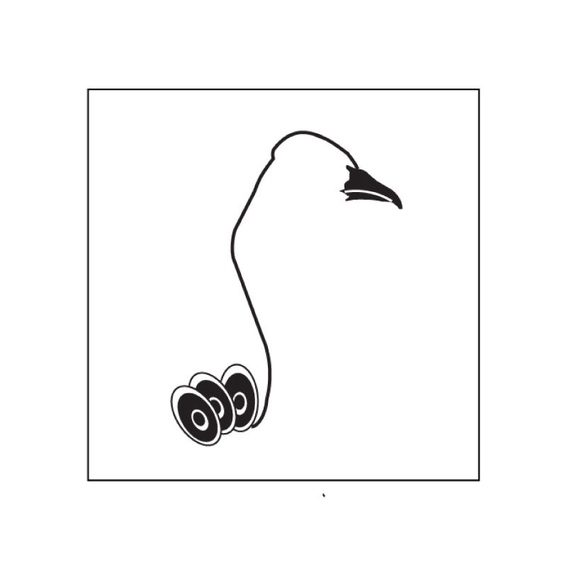
Zoo Pictograms
Students were asked to design a set of six pictograms, using physical “links,” in order to communicate animals belonging in the same taxonomic class. Animals are generally grouped into six types. Students had to choose between one of the below six categories:
Mammals
Birds
Reptiles
Amphibians
Invertebrates
Fish
The goal was to successfully communicate the six animals visually, and develop a distinct "style" that creates a consistent visual language, as if all pictograms belonged to the same pictographic family, and have derived from the same design process and system.
Students were asked to follow a similar attitude as if they were designing for an actual client – in this case the Binghamton Zoo – and they had to develop and provide their own design briefs, conduct visual research, engage in documentation of their creative process, and prototype and present their solutions.
* This project was intended to introduce all students to the toolset, functions, and workflows of Adobe Illustrator. More specifically students were introduced to the pen tool, shape-building techniques, patterns, and modular approaches in design.
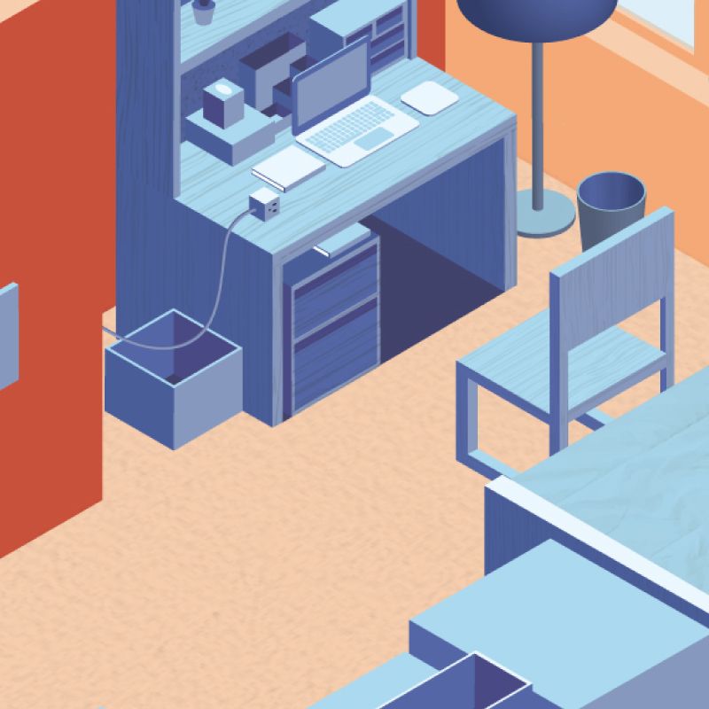
Isometric Room Illustration
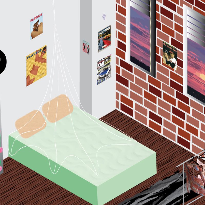
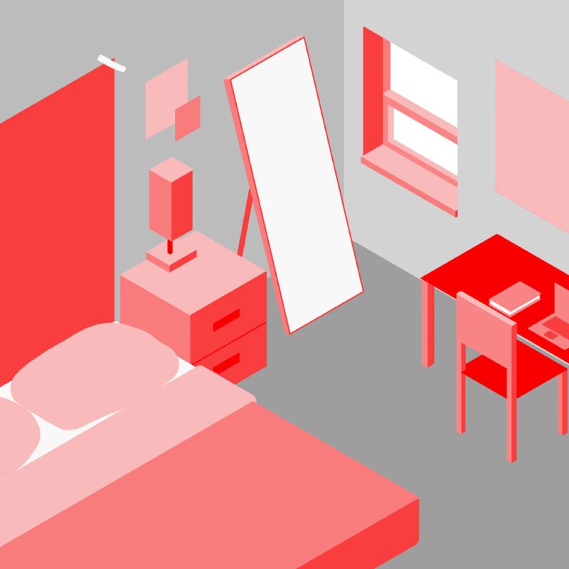
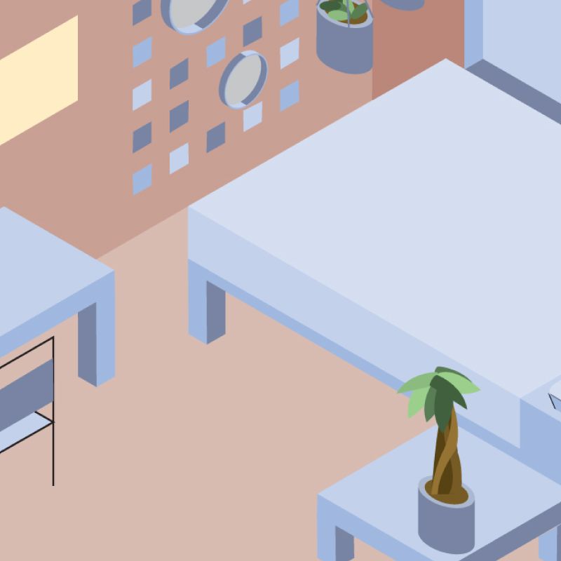
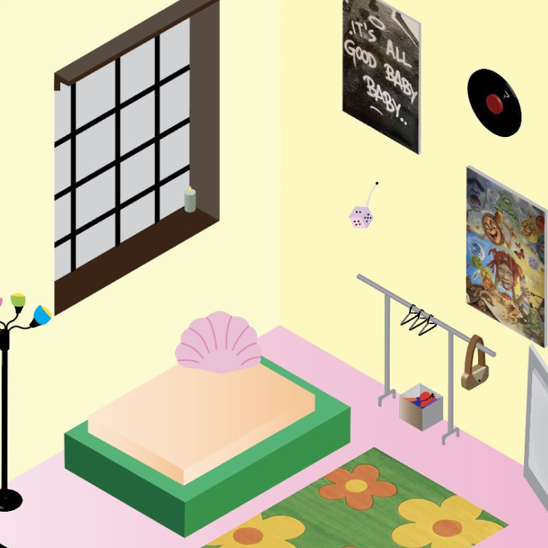
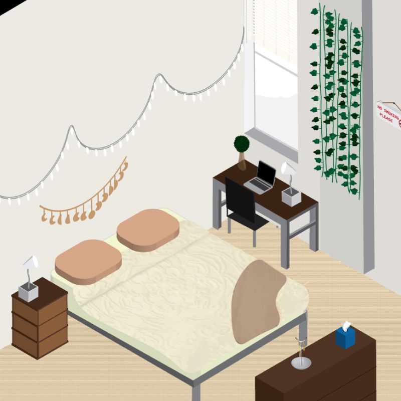
During this pandemic, we have been forced to stay inside our homes, and isolate from the outside world. We spend a lot of time in our rooms, in front of our computer screens, phones, and televisions. We are forced to work out, eat, study, hang out with friends, work, and spend much of our daily time inside our rooms.
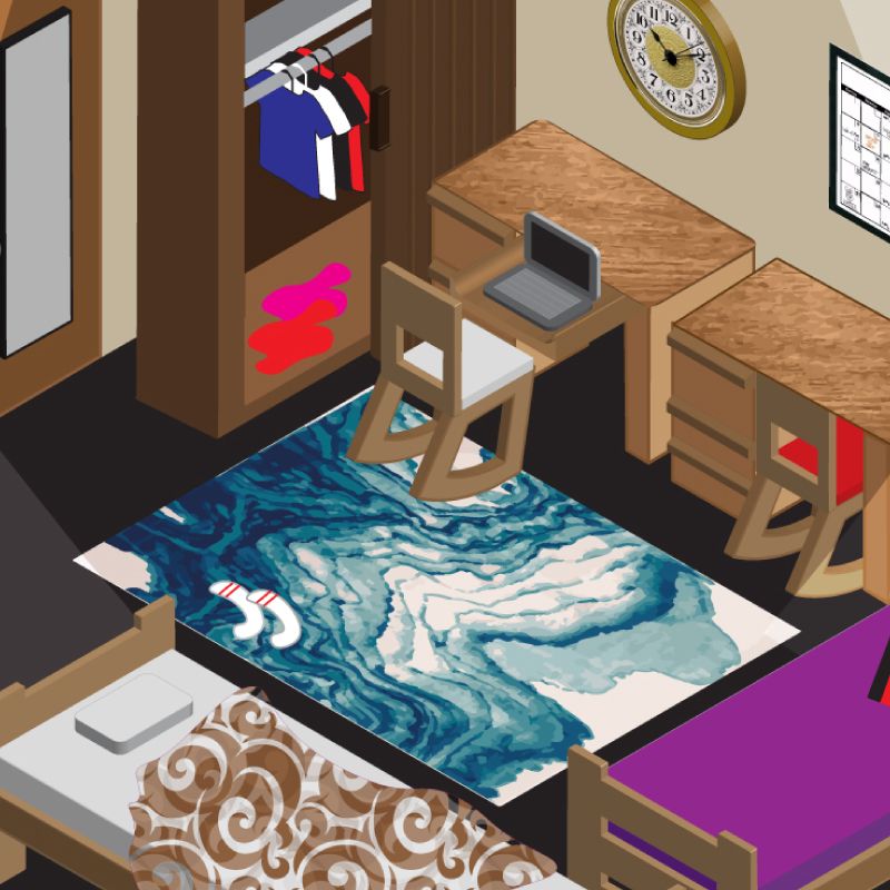
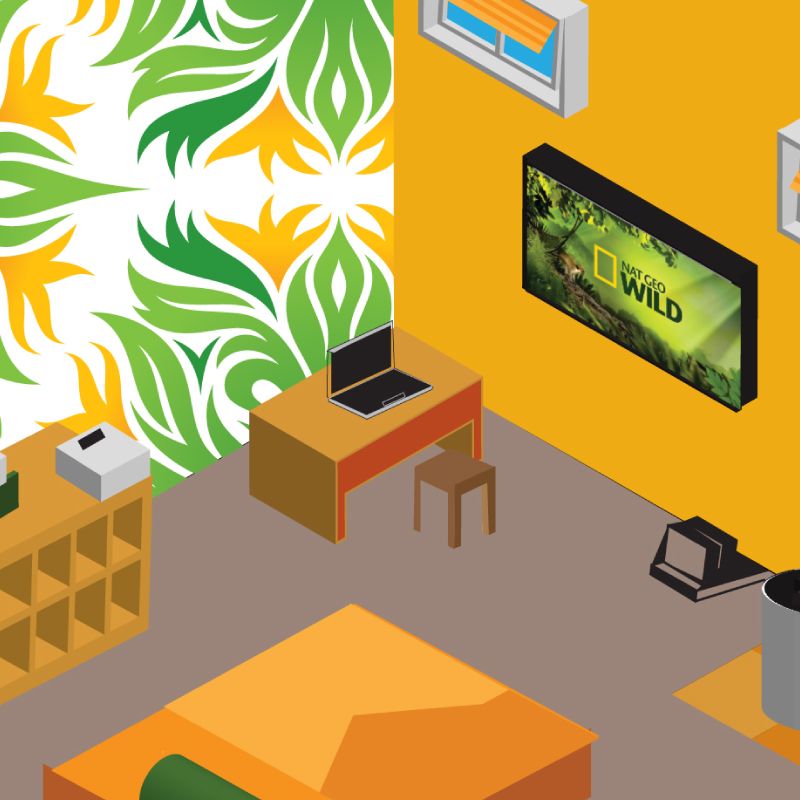
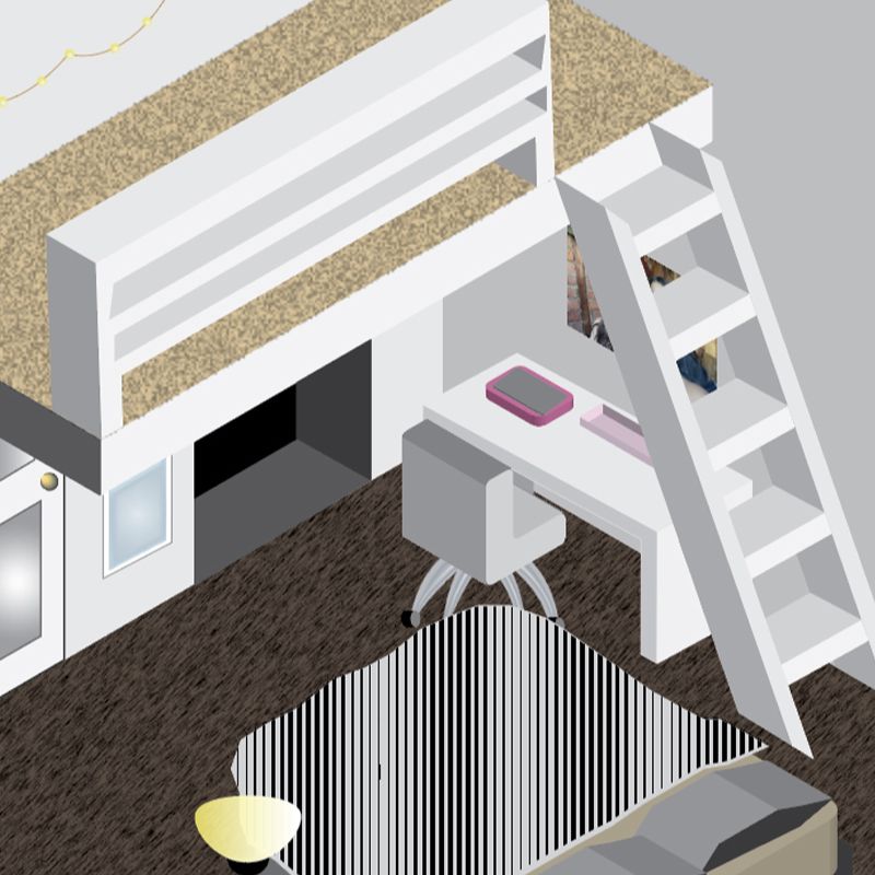
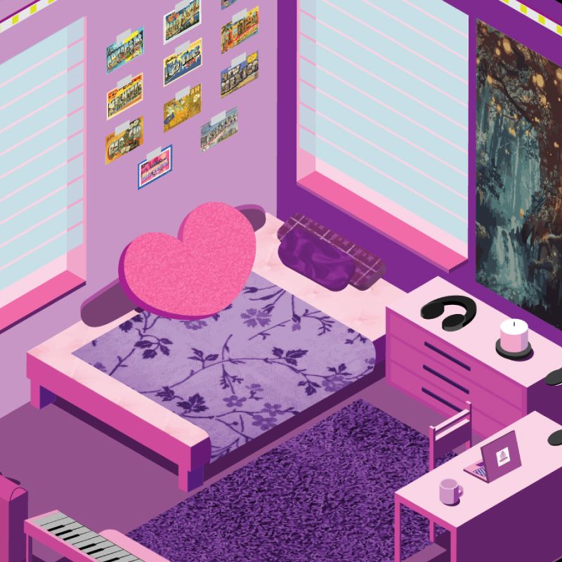
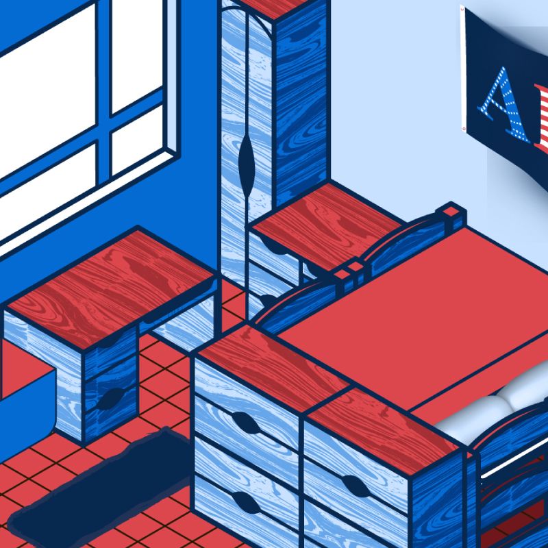
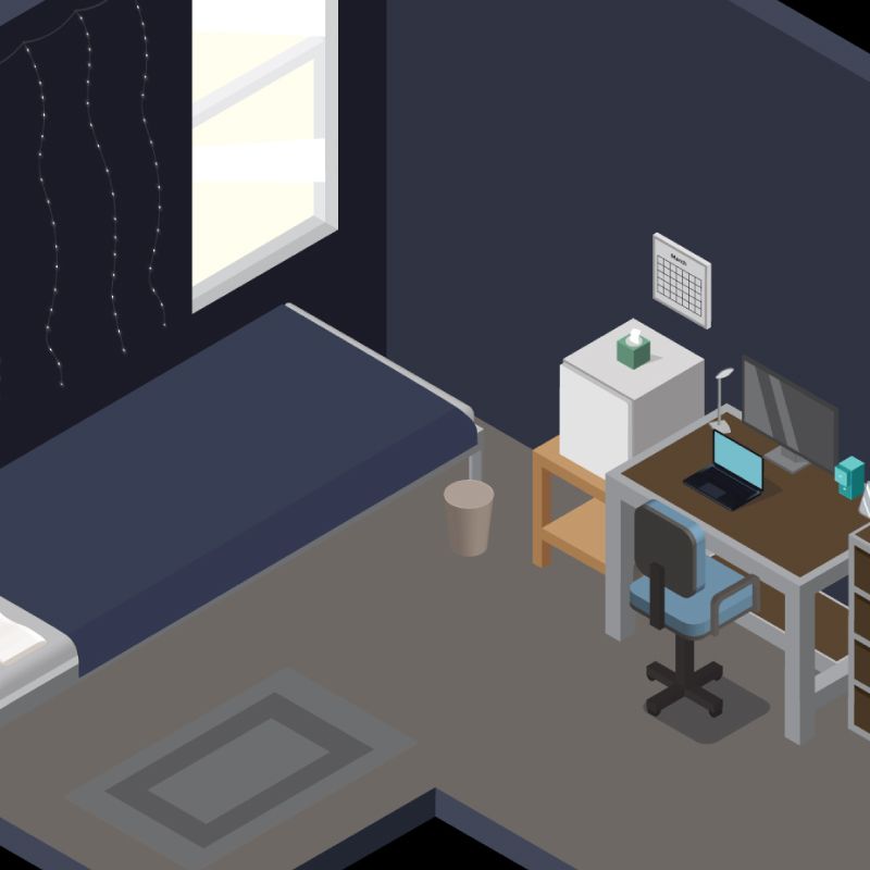
For this project students were asked to observe, measure, and reimagine their rooms* into an isometric illustration using Adobe Illustrator, and its various tools, functions, and workflows.
Isometric illustration is an easy and exact way of creating 3D renderings of objects and entire sceneries. With it, students were able to follow a relatively simple process, in order to create complicated illustrations that have depth, and multiple layers of content. This process also allowed the students to experiment with a lights and shadows.
This project was intended to introduce all students to the toolset, functions, and workflows of Adobe Illustrator. More specifically students were introduced to the pen tool, shape-building techniques, patterns, various ways of creating isometric grids, determining light sources and working with light and shadows, working with digital color palettes, using the 3D extrude, revolve and rotate techniques, adding textures to their illustrations...[...]
* Just like famous artists have done in the past. To offer a few examples, you can think of Wassily Kandinsky's Dinning Room, Roy Lichtenstein's Interior with Restful Paintings, Vincent van Gogh's Bedroom, Konstantin Korovin's Interior, Grant Wood's Sun Shine on the Corner, Eduard Petrovich Hau's Empress Alexandra Feodorovna’s Sitting Room.
How Posters Work
Project description:
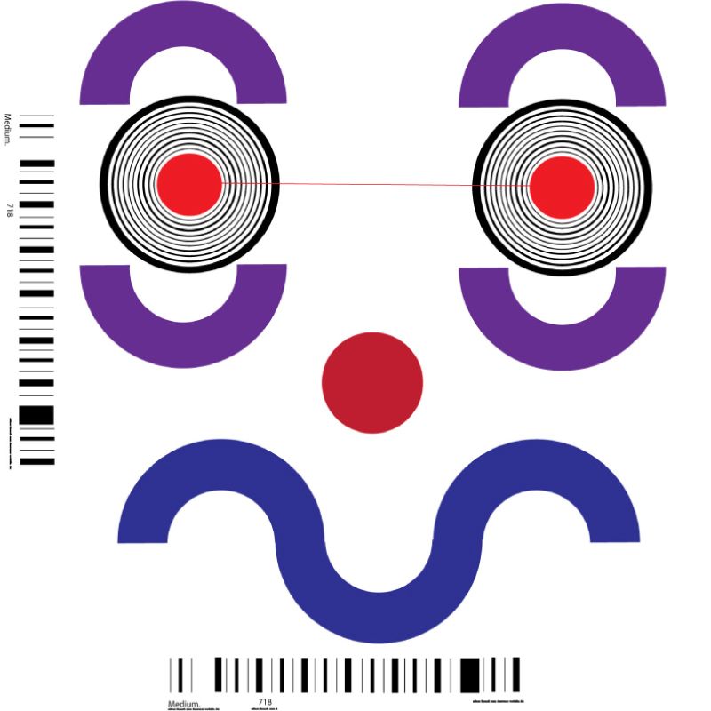
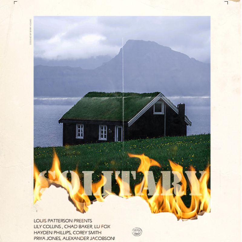
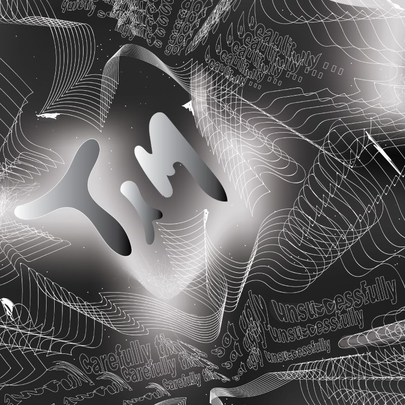
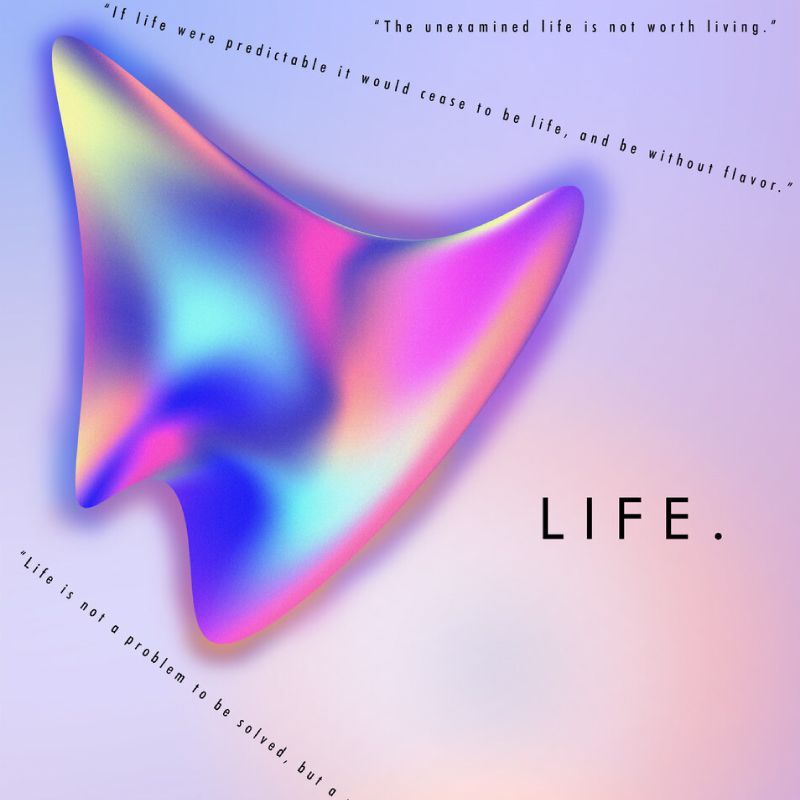
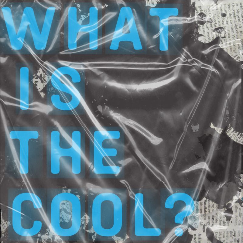
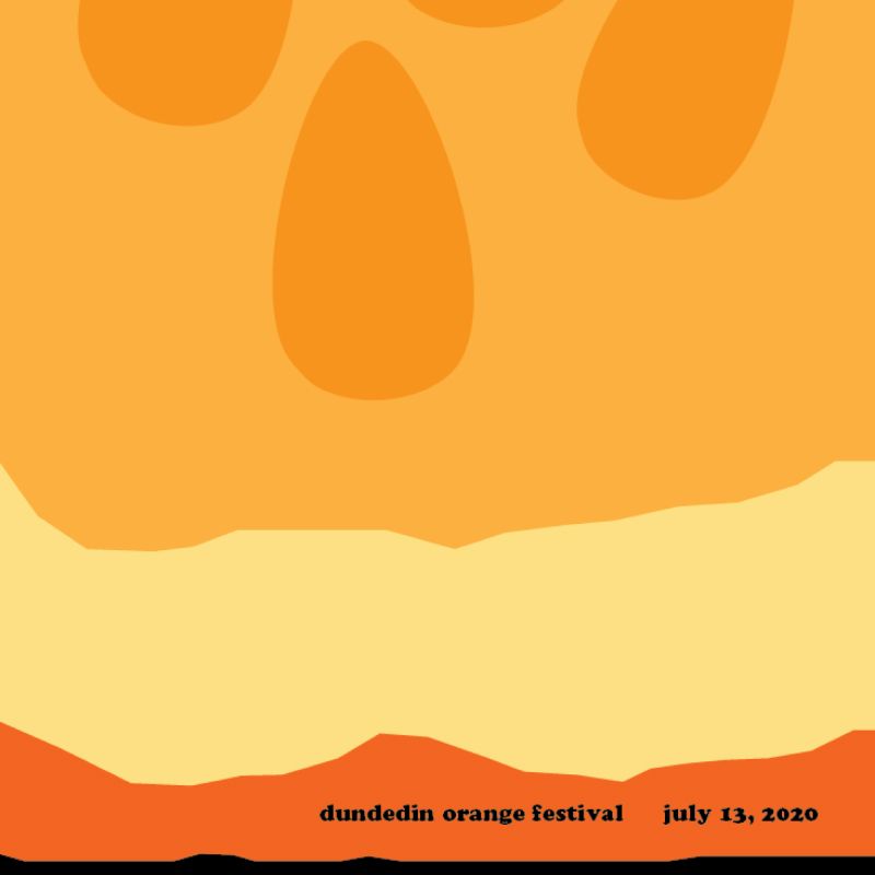
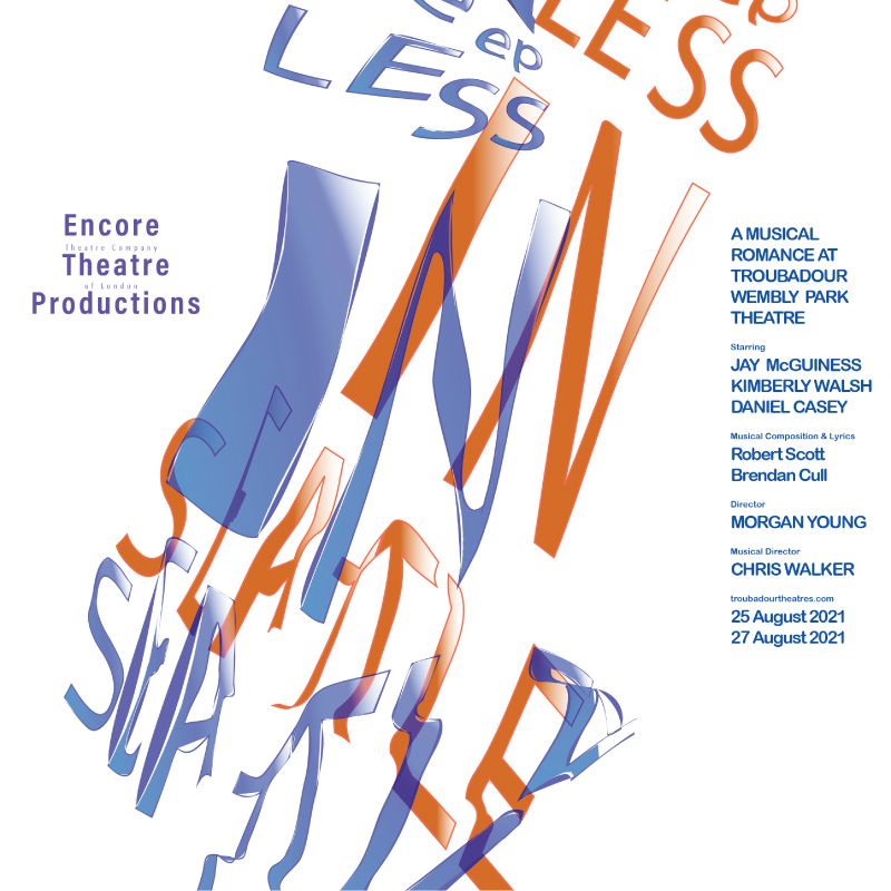
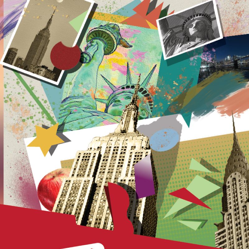
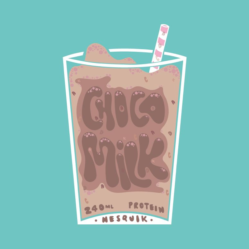
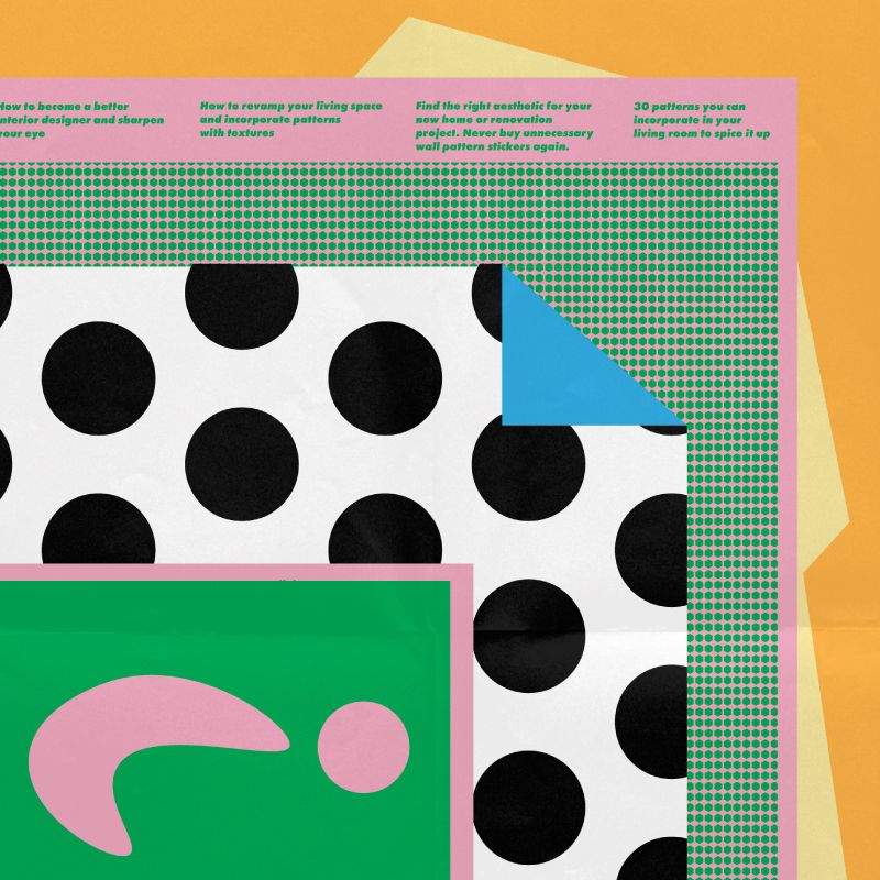
In an attempt to explore/exploit, some of the functions, tools, and processes of design software you will re-create/imagine* three (3) – or more – posters from Cooper Hewitt’s Smithsonian Design Museum permanent poster collection.
If you wish to explore posters outside the museum's collection feel free to do so. Make sure to identify and learn more about the maker, and share with the class if possible.
The posters you choose to work with, have to fall under different categories,** and share different visual characteristics.*** So for example, you can choose to work with a poster from the cut and paste category that focuses on collage, a poster from the simplify category that focuses on illustration, and a poster from the amplify category that focuses on typography.
This project is not meant as a recipe on how to create the >> best << poster. It is a project intended to teach you about how designers see. The works you are asked to re-create/imagine have mobilized principles of composition, perception, and rhetoric. Each poster enacts ways of thinking and making, and each poster wants to be seen. How do we look at graphic design, and how, in turn, does graphic design looks back at us? (paraphrased from How Posters Work by Ellen Lupton).
During the following weeks you will learn how to observe, analyze, and deconstruct works of others, and create your own interpretations of them. You will also learn how to utilize analog, and digital tools and processes in order to do so.
*
Your work does not (!) have to be an exact reproduction of the original poster, but rather pay tribute to the ways of thinking and making behind the process of creating such a poster.
**
Focus the Eye
Overwhelm the Eye
Simplify
Cut and Paste
Overlap
Assault the Surface
Activate the Diagonal
Manipulate Scale
Use Text as Image
Tell a Story
Double the Meaning
Amplify
Make Eye Contact
Make a System
***
Typography
Illustration
Photo montage
Type + image
Photographic
Handmade
Scan
Collage
[...]
Facsimile
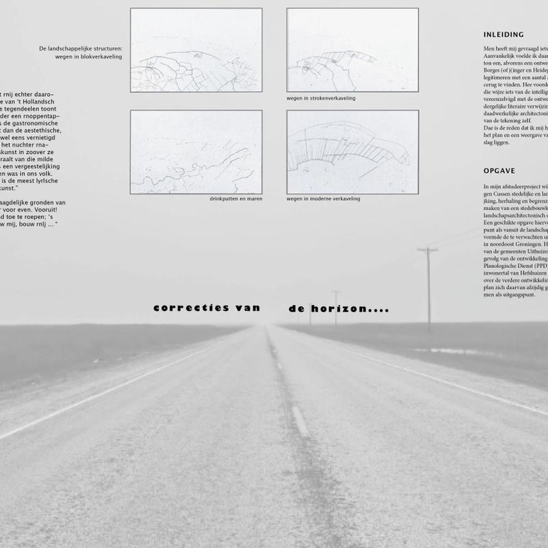
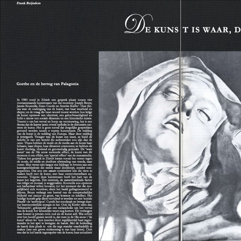
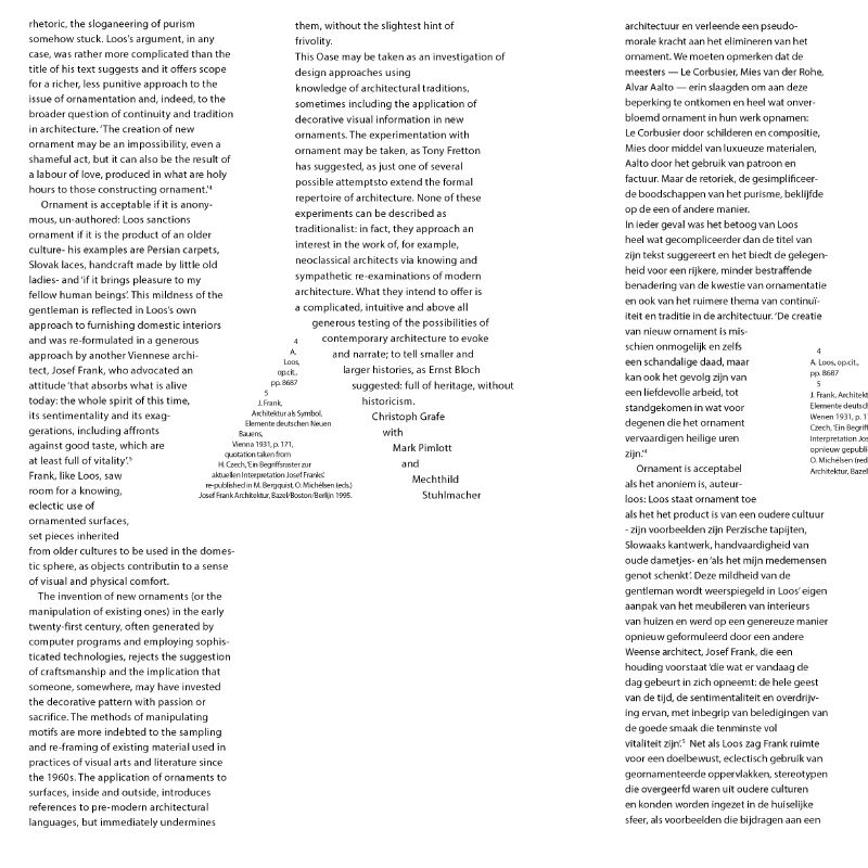
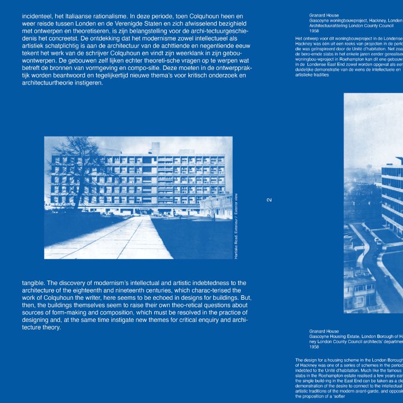
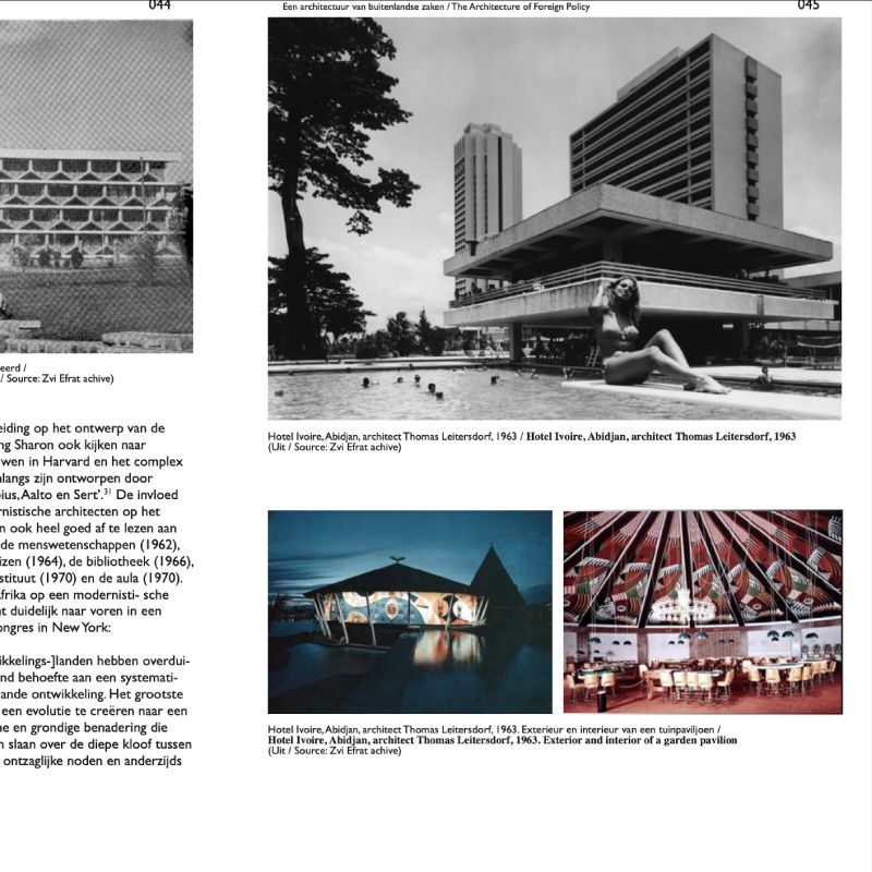
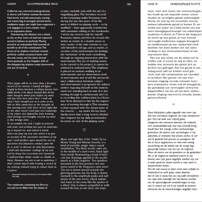
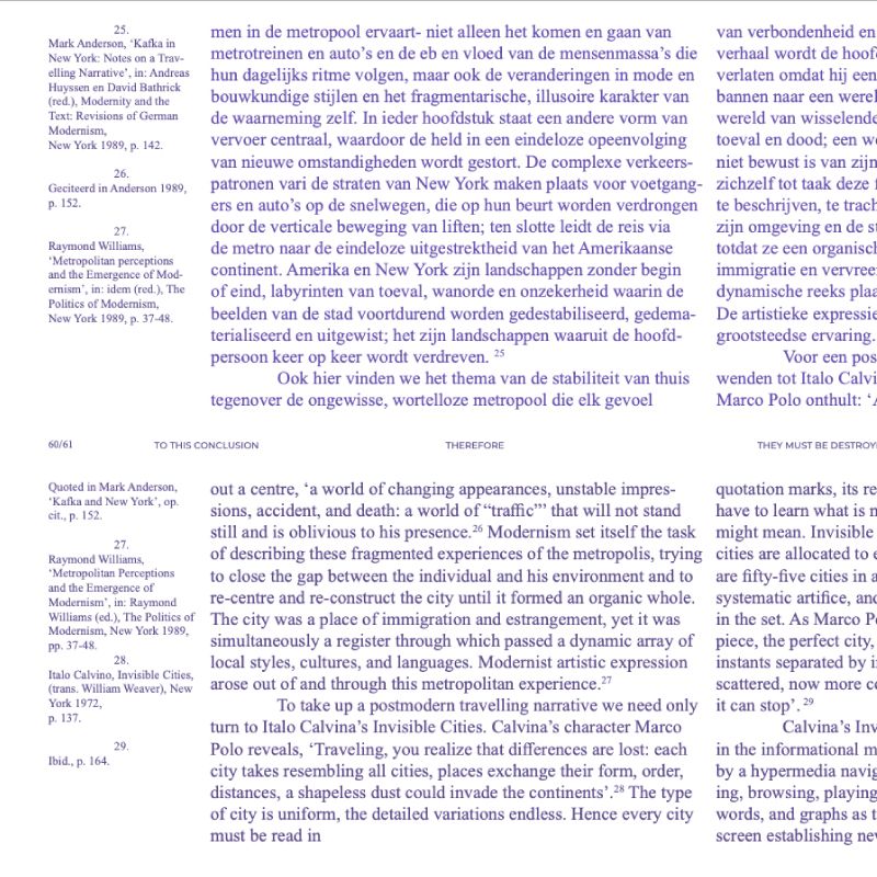
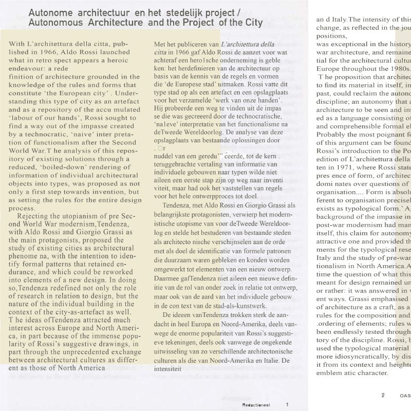
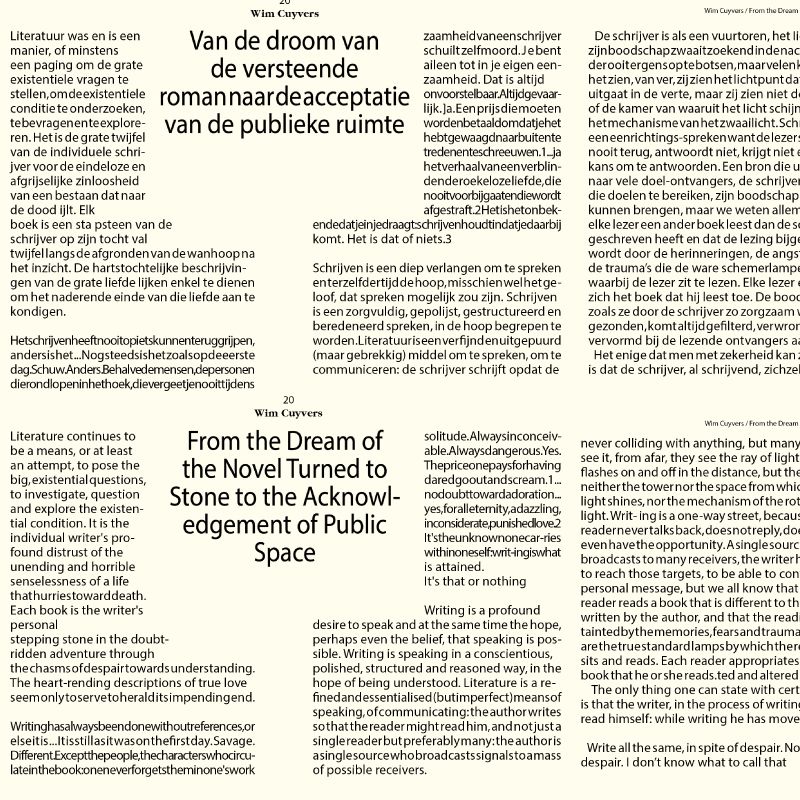
Select an issue of OASE journal (pdfs of interior pages are available). Study the grid, layout and typographic rules that run throughout the issue, and reproduce 3 spreads from the issue in InDesign.
OASE Website:
https://oasejournal.nl/en/Issues
~ First identify the size of the page.
~ Use rulers to recreate the grid of each page/spread. If needed print the original page/spread and measure everything using a ruler.
~ Try to identify the typeface in use. If you can not find the exact one use a similar typeface. Try to match the type size in use.
~ Copy and paste the text from the pdfs.
~ For images you can screen shoot them or try to find them via Google search.
~ After you are done print and inspect your design. Look out for possible mistakes and/or elements you left out.
