Graphic Design Software II
Projects
Overprint Poster
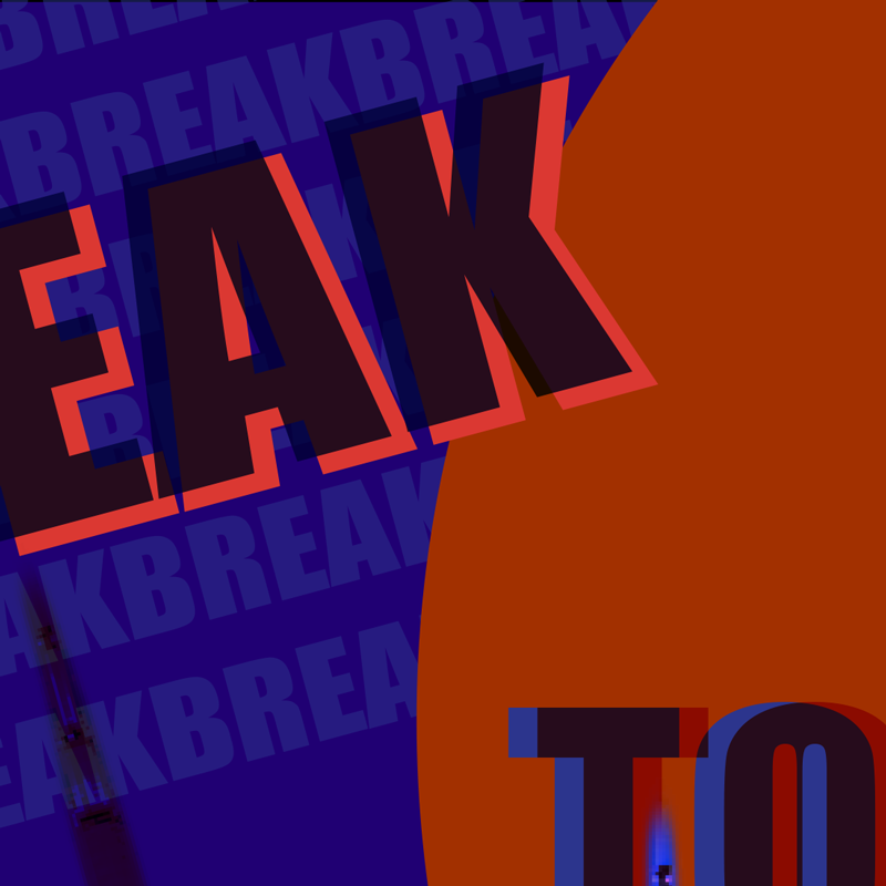
The overprint technique is one that can lead to the creation of interesting effects and visual interest within a design. It was once only used by pre-press technicians to ensure a design would be correctly reproduced at the printing stage, but these days graphic designers use overprints in a creative way.
Students were tasked with developing a poster in Illustrator and/or Photoshop that utilizes overprinting techniques in the color relationships between layers that achieves harmony, meaning, narrative, or emotion.
Knowledge Design
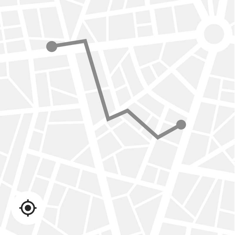
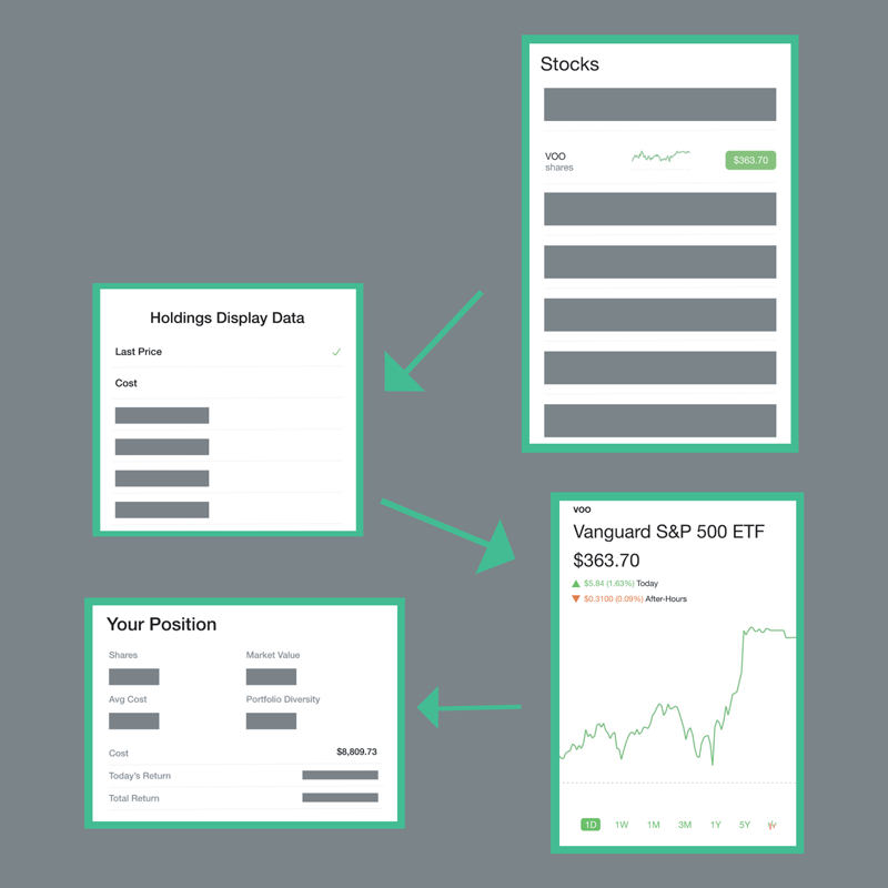
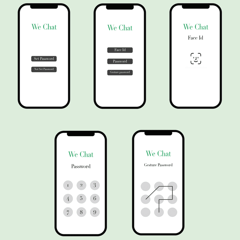
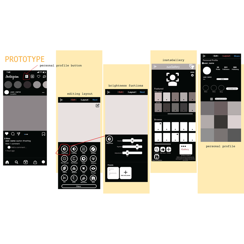
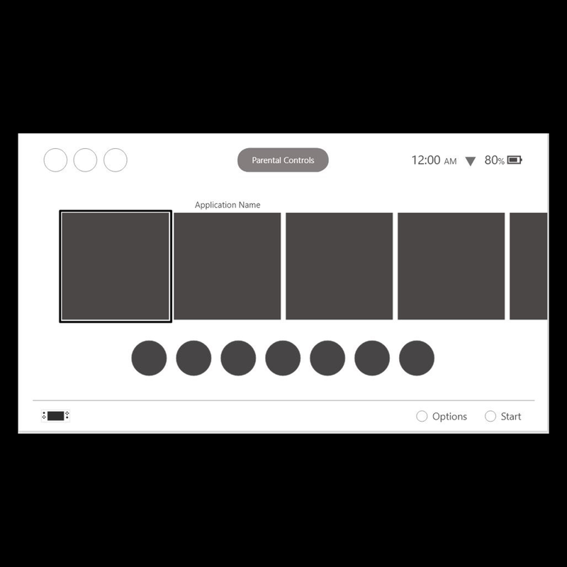
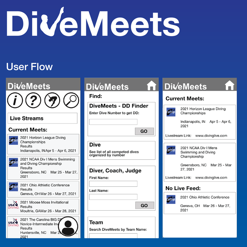
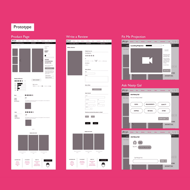
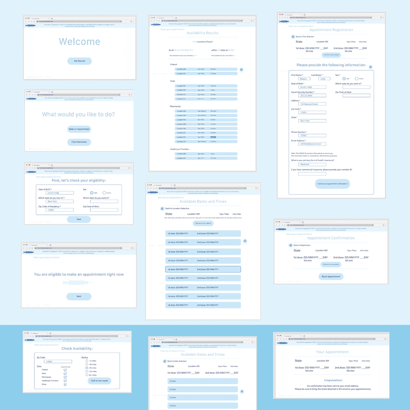
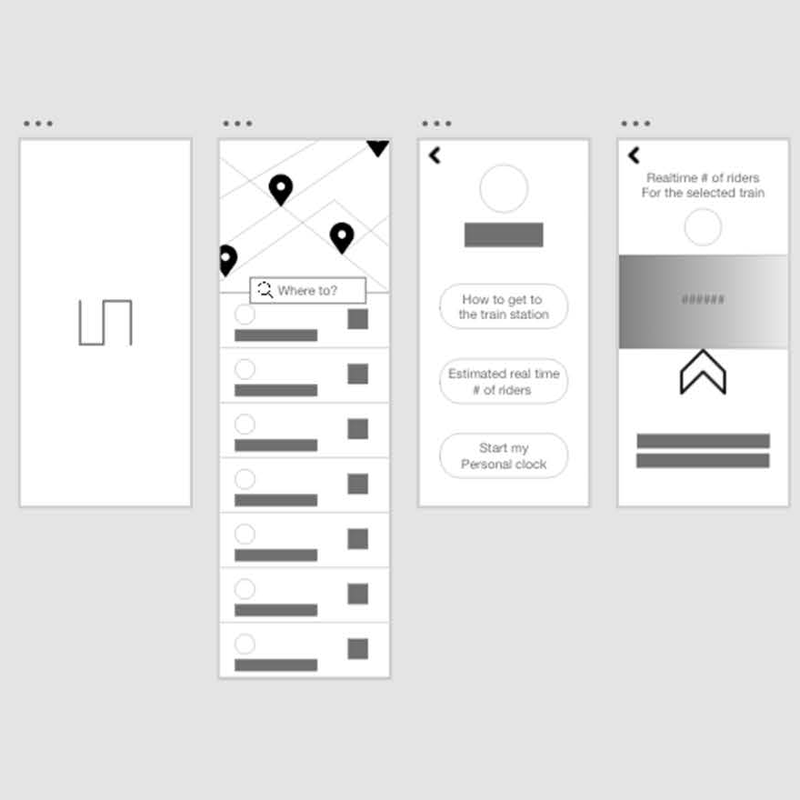
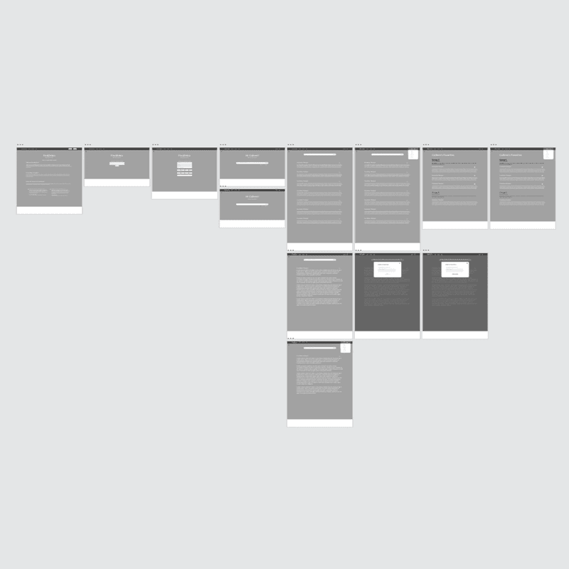
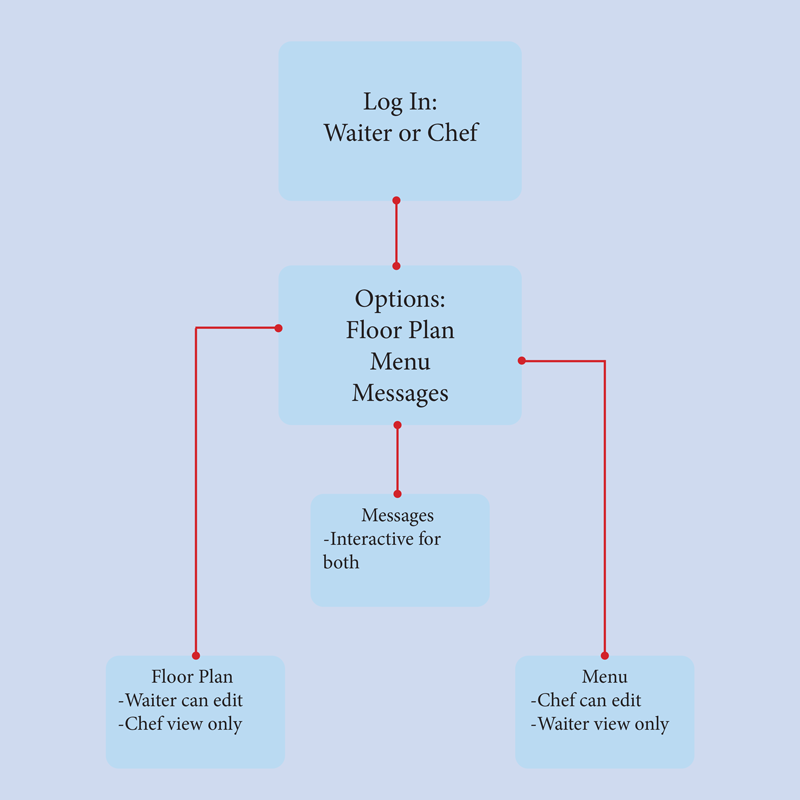
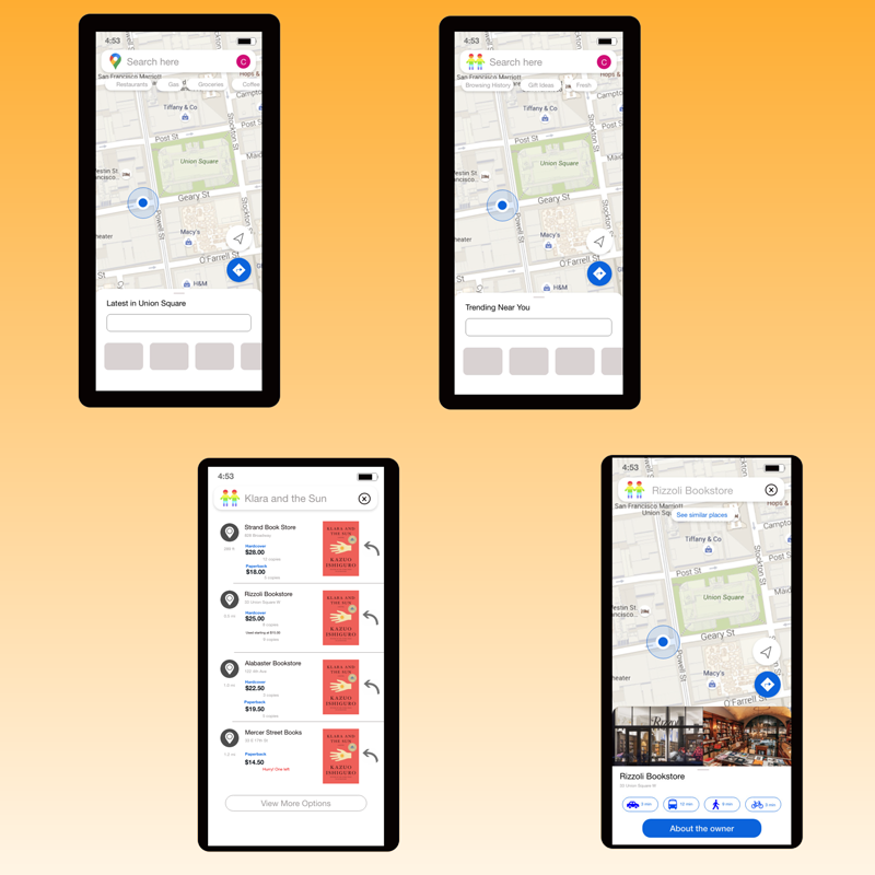
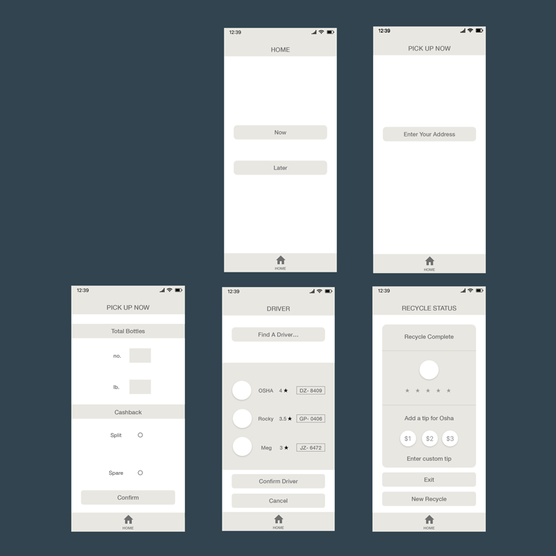
As the internet has matured we can now recognize common design patterns in most of the applications we use. There’s the share pattern, the contact pattern, the please read more right now pattern, etc. But just because we come across patterns doesn’t mean we can’t question them – ask what’s missing, ask if they work, if they help, if they can be improved, if they are even necessary. It’s always a good idea to revisit old patterns. As individuals, when we do this we call it self improvement. In user experience design, we call it being an advocate.
The goal of this project was to imagine or reimagine a process or flow as part of an application design. For this project we attempted to focus on the “active“ portion of inter-activity. Students revisited an old pattern in order to reassert the user, not as a simple, passive consumer, but rather, a producer in their own right, with power and agency.
Collaborative Book
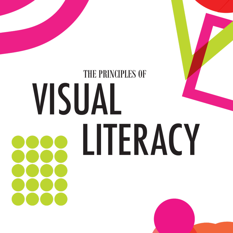
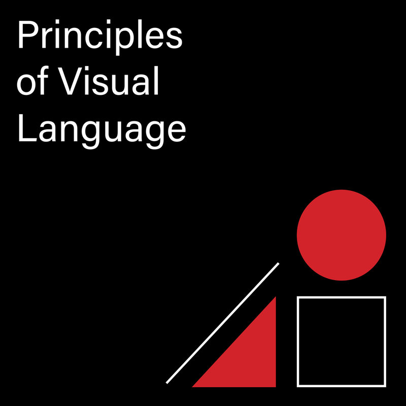
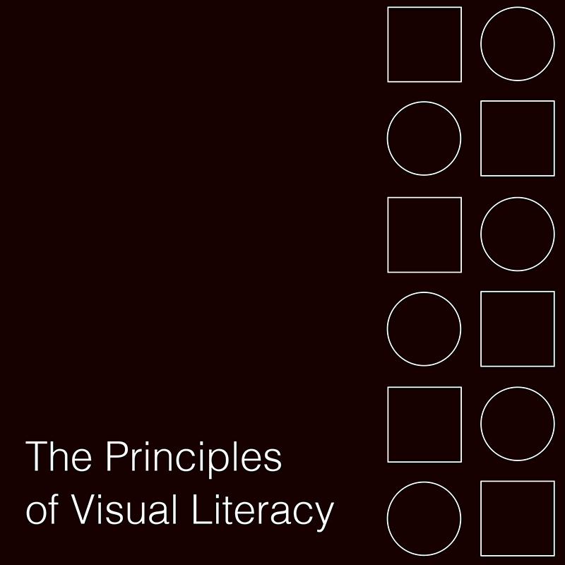
The square, circle, triangle, point, line, and plane are the building blocks to form. Then there are the building blocks to visual communication: Closure, common fate, continuation, figure/ground, similarity, proximity, and symmetry are the principles of visual language theory from Max Wertheimer’s Gestalt laws of Perceptual Organization, published in 1923. These “rules” have been extended, most notably in Donis A. Dondis’s classic book on visual language, A Primer of Visual Literacy (1973).
This group book is a celebration of design principles. It's also an exercise in compromise, collaboration, restraint, workflow, and process – a few of the less visible components that go into smart design.
