Graphic Design Software II
Projects
3 Wine Labels, 3 Target Audiences
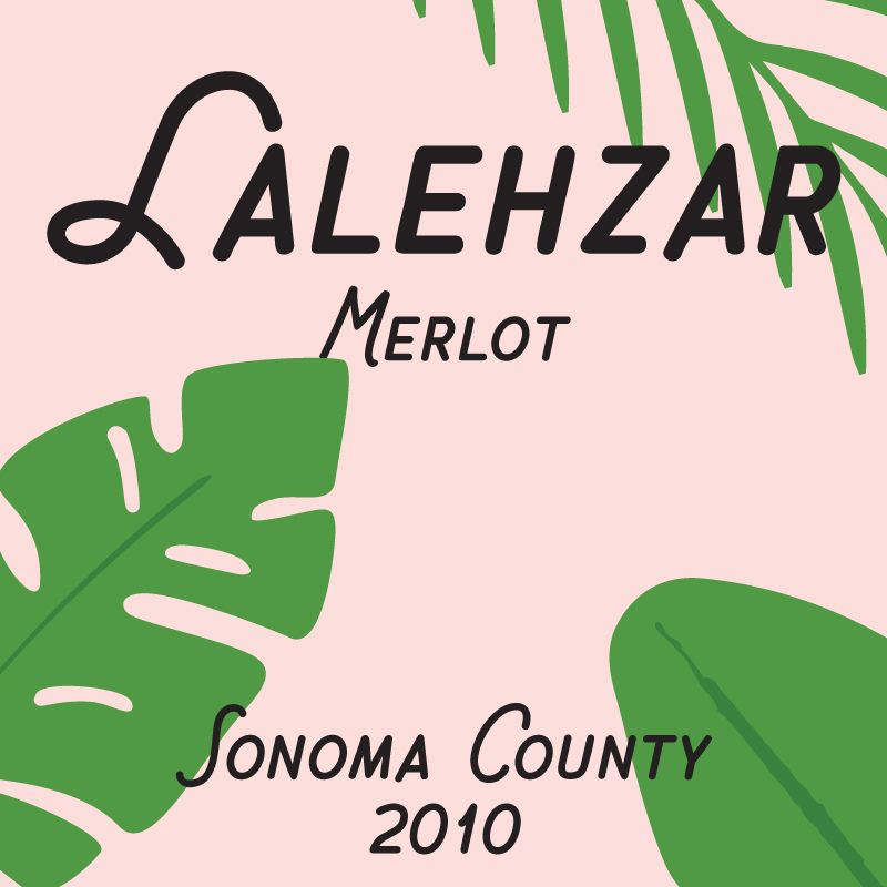
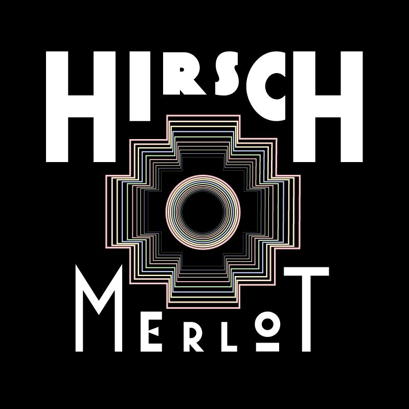
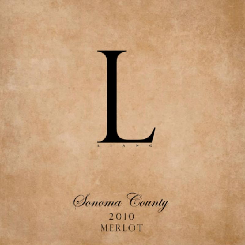
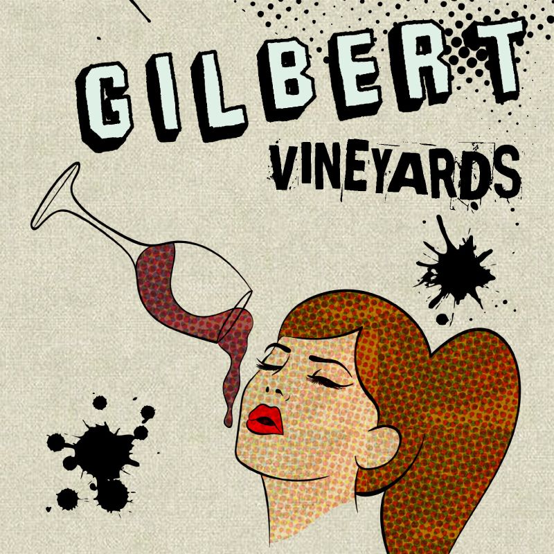
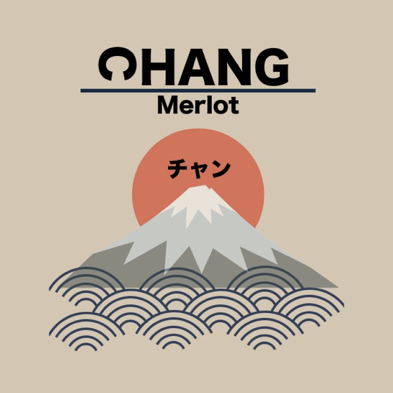
Students were asked to develop designs for 3 different wine labels. They were instructed to follow a similar attitude as if they were designing for an actual client – in this case a winemaker – and they had to develop and provide their own design briefs, conduct visual research and field studies at wine stores with focus on understanding how different wines are marketed to their customers, engage in documentation of their creative process, and prototype and present their solutions.
Proposed market positions:
1. Traditional / high quality / premium / expensive
2. Contemporary / modern / leading edge
3. Casual / fun / sense of humor
3 Posters, 3 Ways
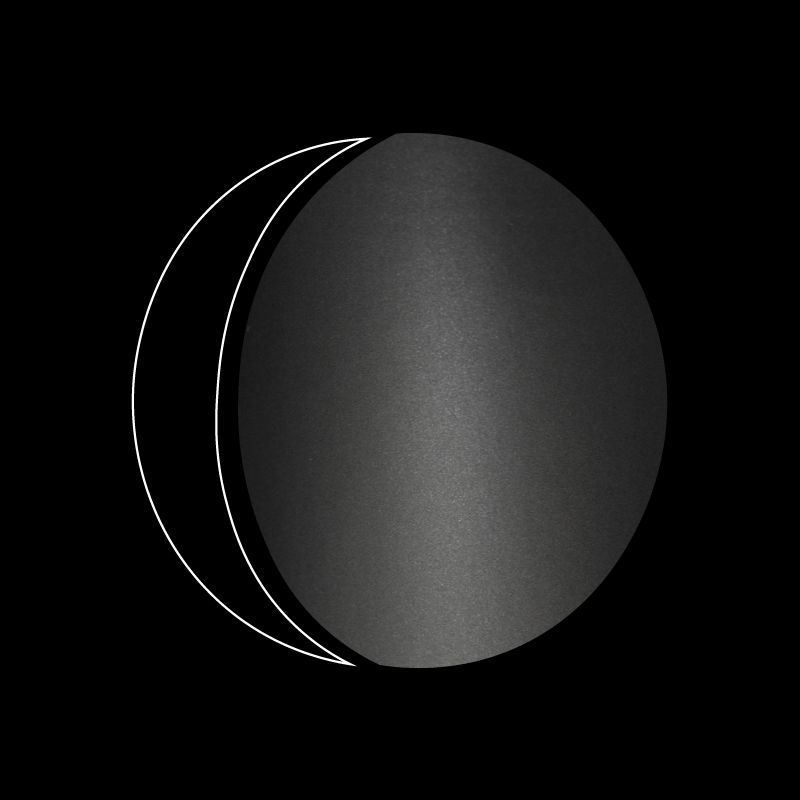
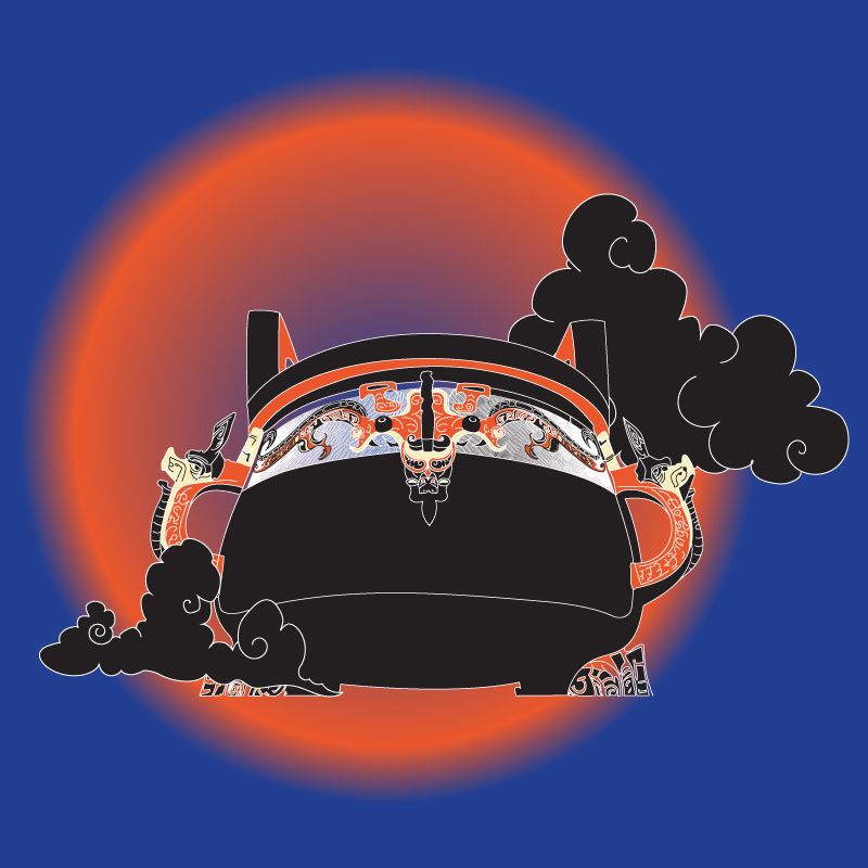
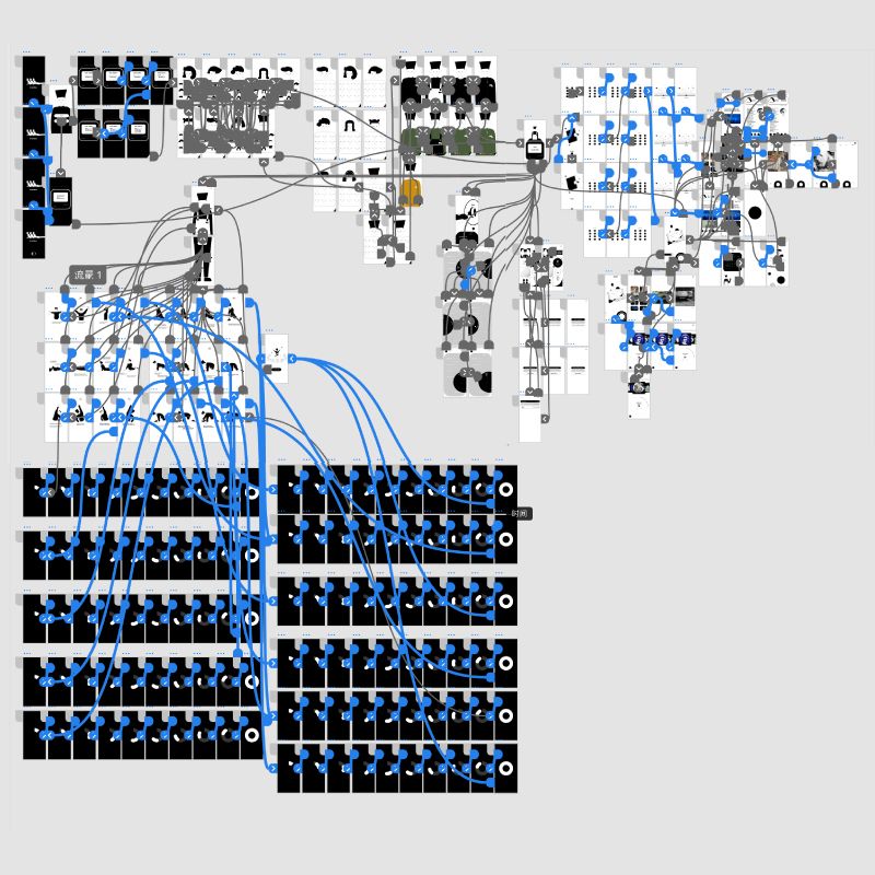
Students were asked to research and define a list of words* provided by the professor. Students had to choose a word from the given list to work with for this assignment. The objective was to create 3 different posters (not variations) that thematically translated (interpreted, made a connection of meaning with) their chosen word in relation to another concept of their choice. The students could define the word and concept of choice by any means: analogy, parody, contradiction...[...] **
Strict limitations were imposed on each poster, and they are outlined below:
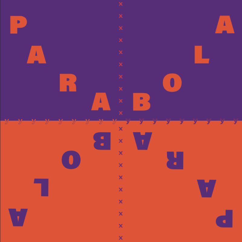
Poster #1: Use type only
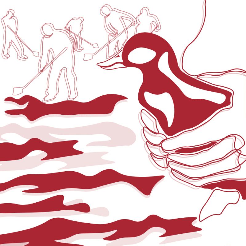
Poster #2: Use image only
Poster #3: Use a combination of type + image
* bricolage, convergence, denotation, dissonance, hybrid, hyperbole, isomorphic, kitsch, lexicon, mélange, metonymy, mnemonics, modularity, morphology, nascent, nonlinearity, pastiche, polysemy, simulacrum, tautological, vernacular, zeitgeist
** Project was inspired and based on an original project concept by professor Sharon O.
DIY Collaborative Publication
Project description:
For this project you will work individually and as a team in order to produce a DIY publication. Together we will explore the world of independent publishing and look at examples of DIY publications. We will explore InDesign workflows and processes and talk about the different elements that a publication consists of.
You will decide as a team on the size, format and content of the publication as well as the designs of the book cover (front+back), table of contents, credits, bio, and colophon.
In order to treat this project as an exploration, but at the same time mimic real life circumstances, each one of you will become art director/editor of a chapter of the publication. This way you can choose the content and create the rules of your layouts. Each one of you will create a model layout, and then you will also design based on the layouts of your classmates. By doing so, you become art director/editor and production artist at the same time. These are both roles that you might have to take in the future, while practicing graphic design.
When you create the rules of your layouts you should consider typographic rules such as fonts, size, color etc. You should also consider the overall look of the page/spread such as number of columns, photographs/illustrations, grid, page numbering placement etc.
