Special Studio Projects: Graphic Design
Projects
P1 Picturing Numbers
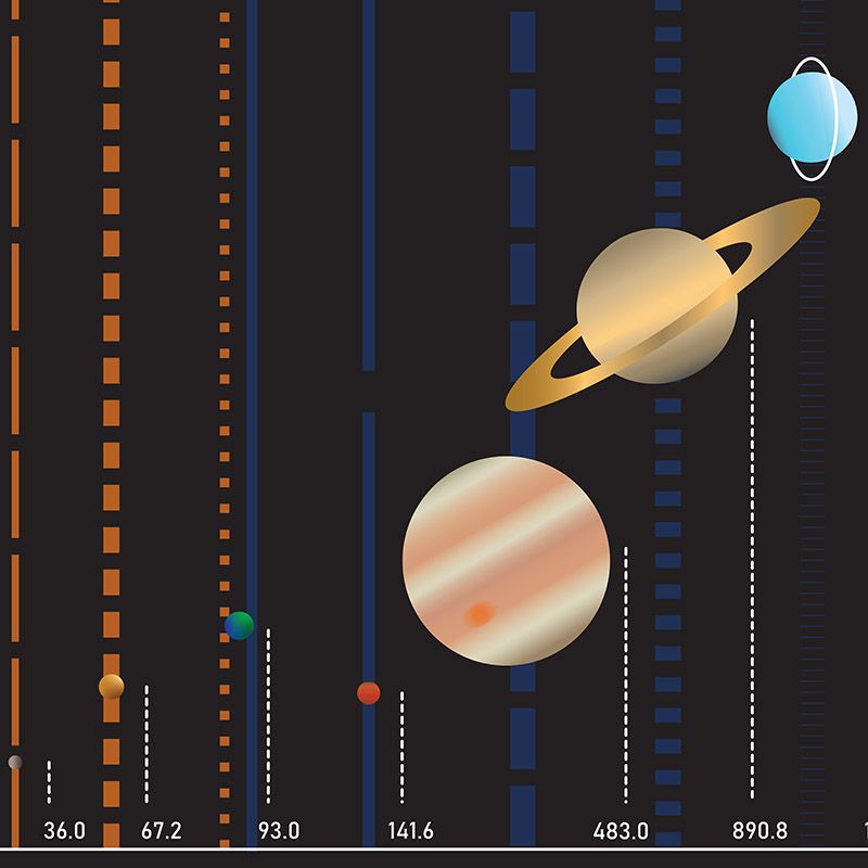
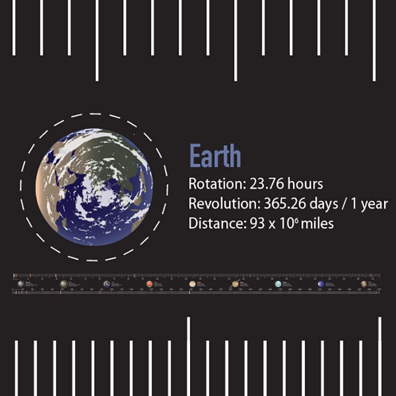
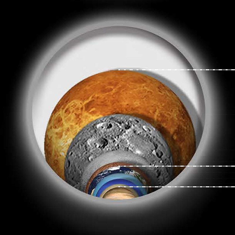
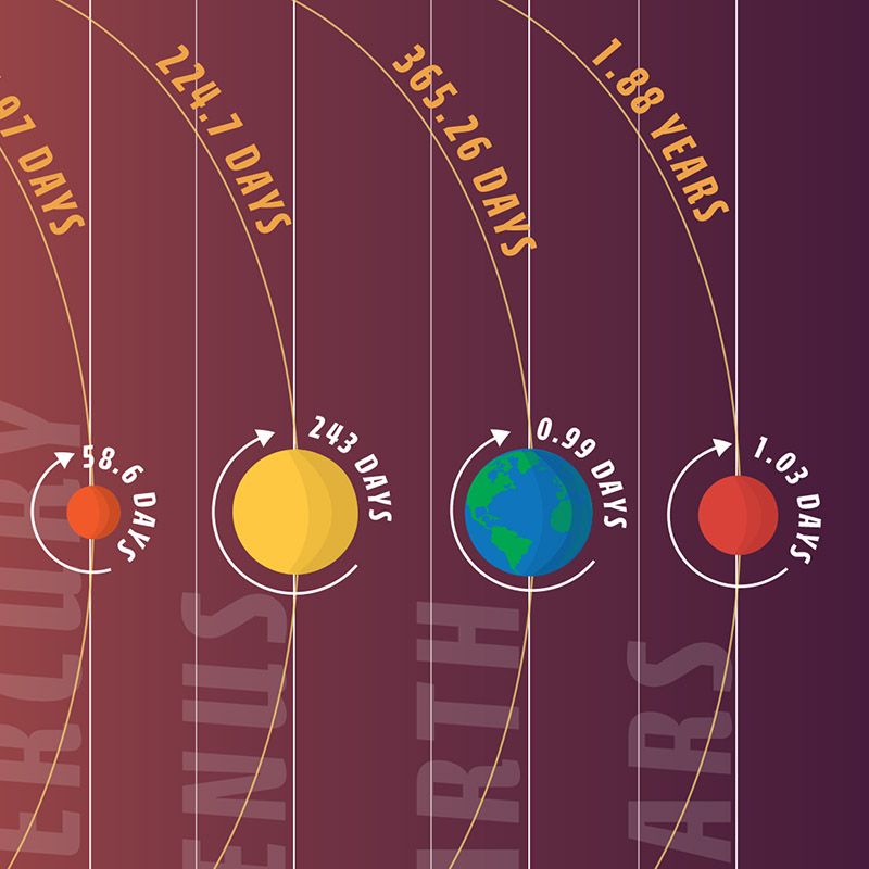
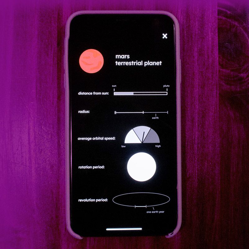
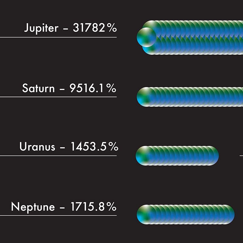
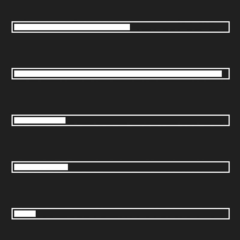
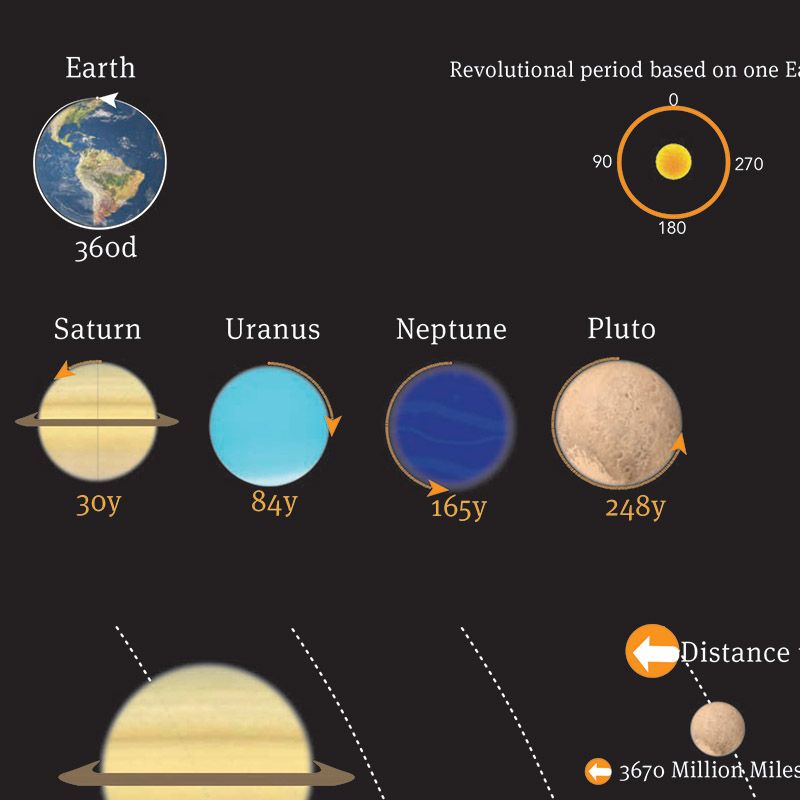
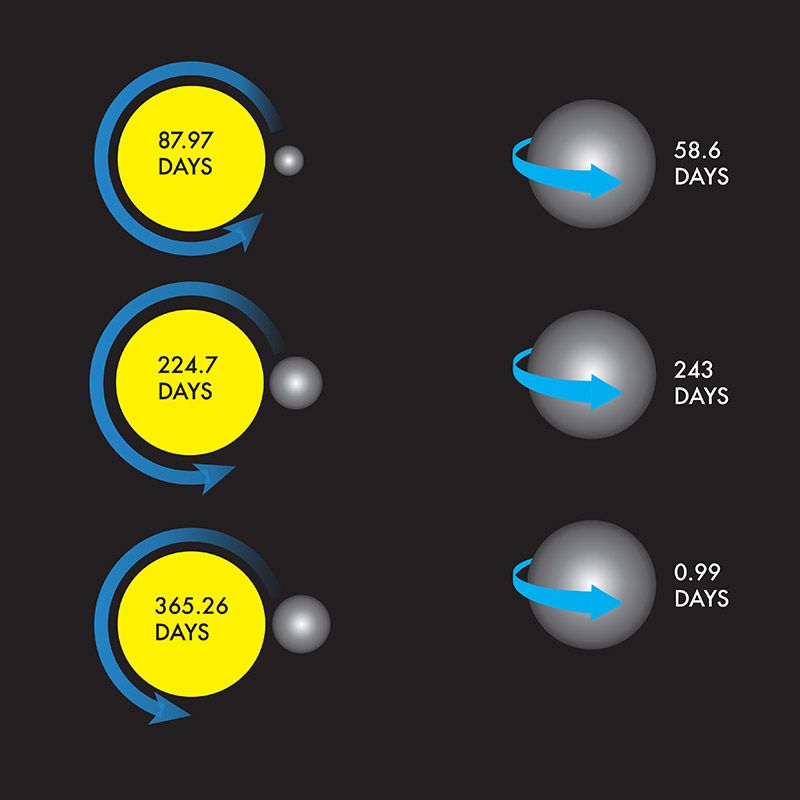
We shall plan and interpret the Planet Rotation numbers, and design an infographic for them. The artwork has to give visual evidence to your narrative. Gather, organize and use spatial, chronological, and quantitative data. The medium for presentation is part of your concept (static, dynamic, interactive).
The project interprests the following “Planetary Fact Sheet”:
https://nssdc.gsfc.nasa.gov/planetary/factsheet/
“You can choose to organize information according to different variables, each way will permit a different understanding of the information. So the choice will be determined by the story you want to tell.” —Richard Saul Wurman
P2 UX & Interface
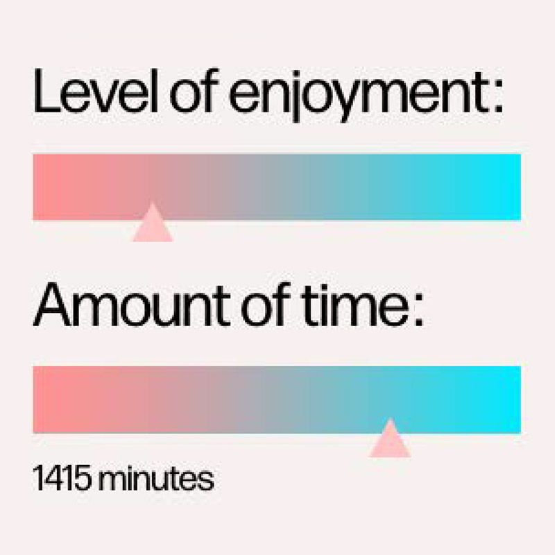
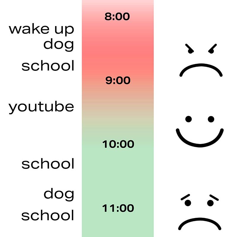
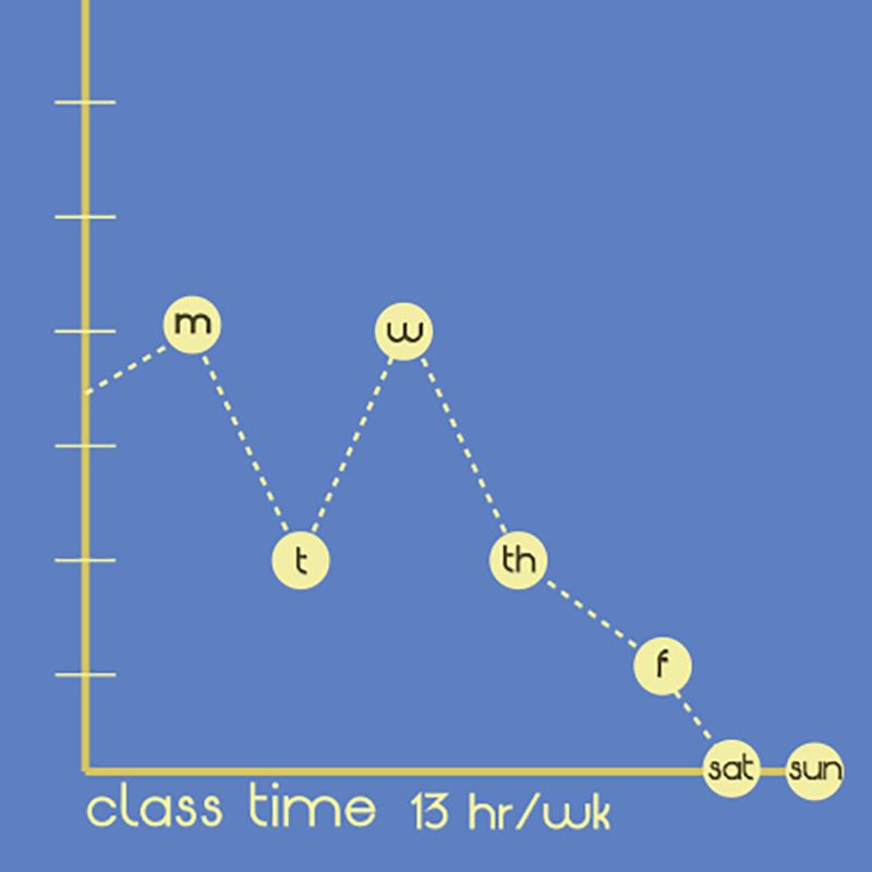
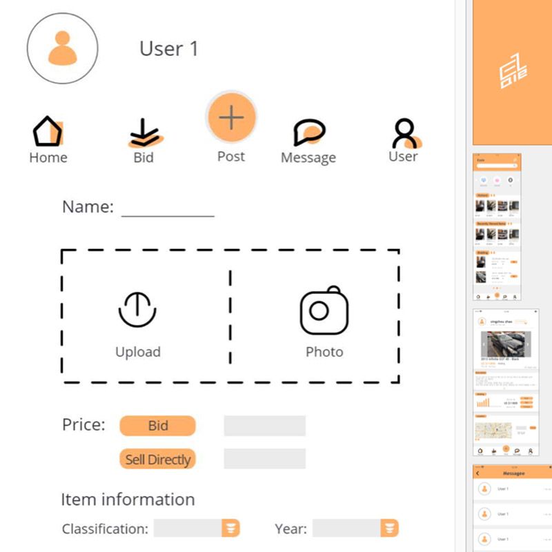
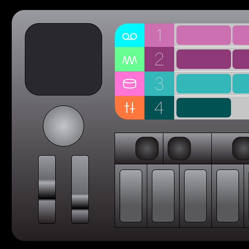
We shall design the taxonomy and an interface for your weekly activities, your “Weekytum,” and produce the application as a series of “boards“ the size of your ’phone screen, even if you prototype with XD, Sketch, InVision, or alike. Daytum is a project released by Nicholas Felton in 2008 (feltron.com). The inspiration was to evolve the methodology of the annual reports into a new self-expression platform.
P3 Individual Project
We shall think more like a freelance designer with this final project — it is both self-initiated, and the process is something you have to figure out as well. Present ideas in organized threads. You can choose from three options:
1. Pitch a new project idea, and design the parameters for it.
2. Enhance & expand an existing project of yours, and design the timeline for it.
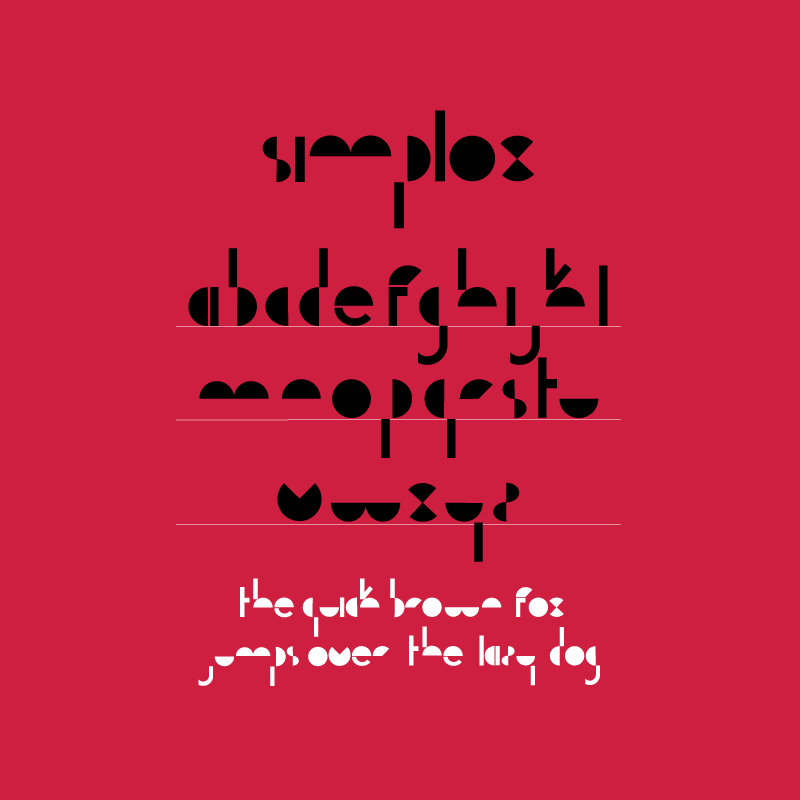
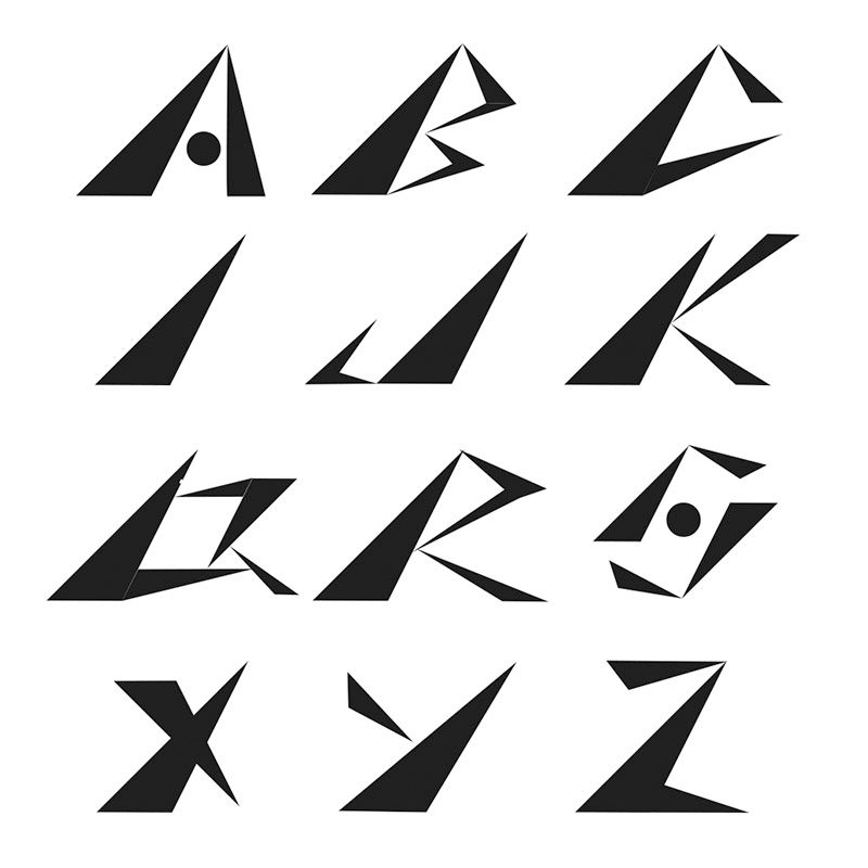
3. Draw a typeface (original or revival, not handwritten), and you design a font prototype.
