Communicating With Type
Projects
P1 Letter Project
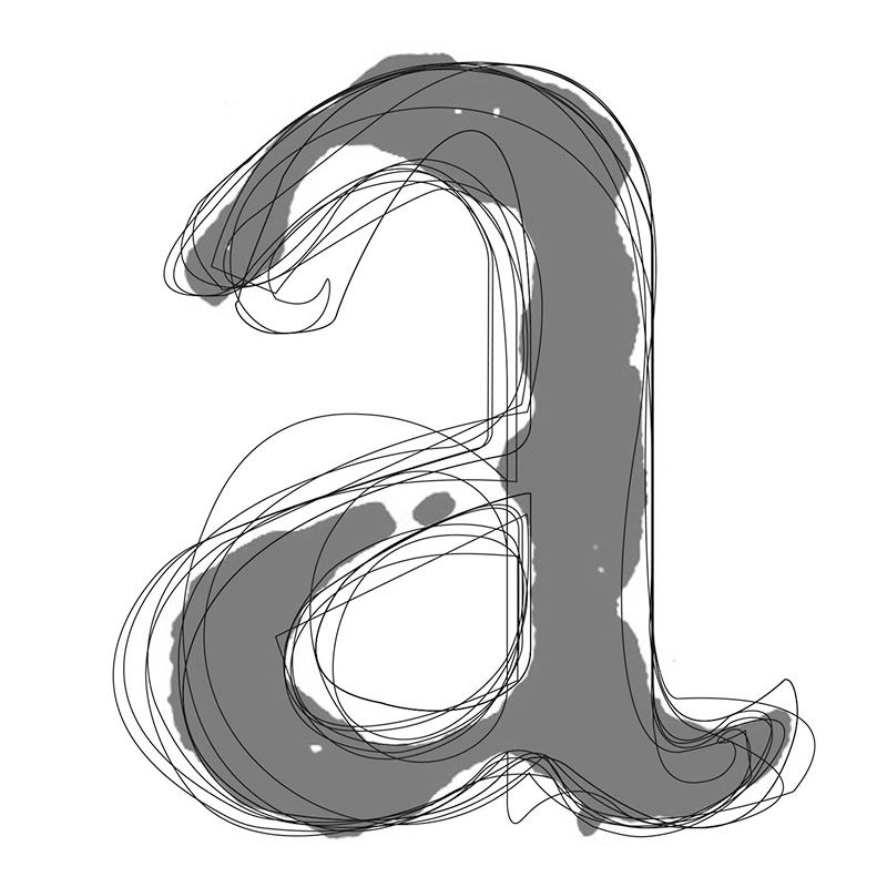
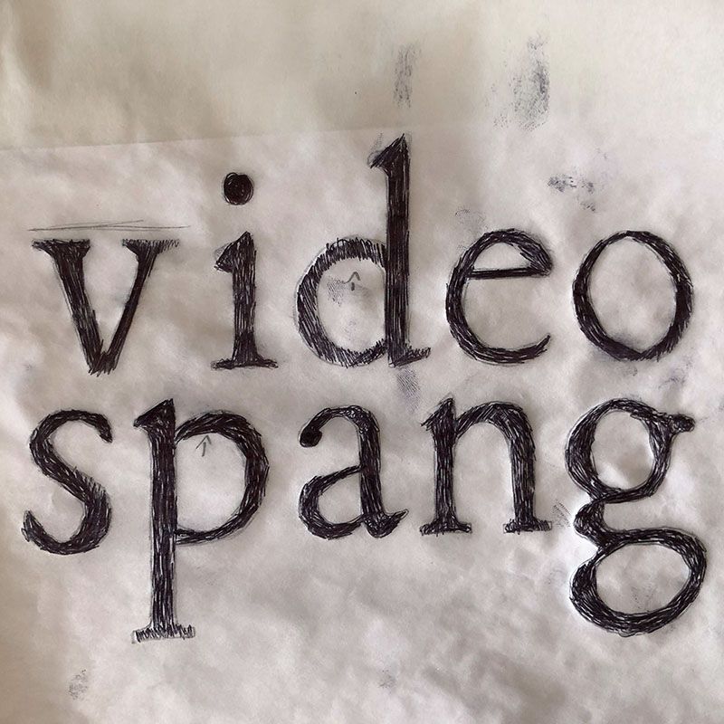
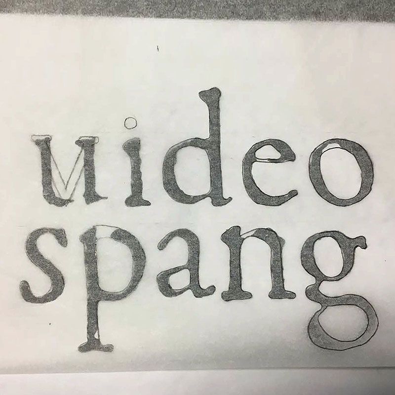
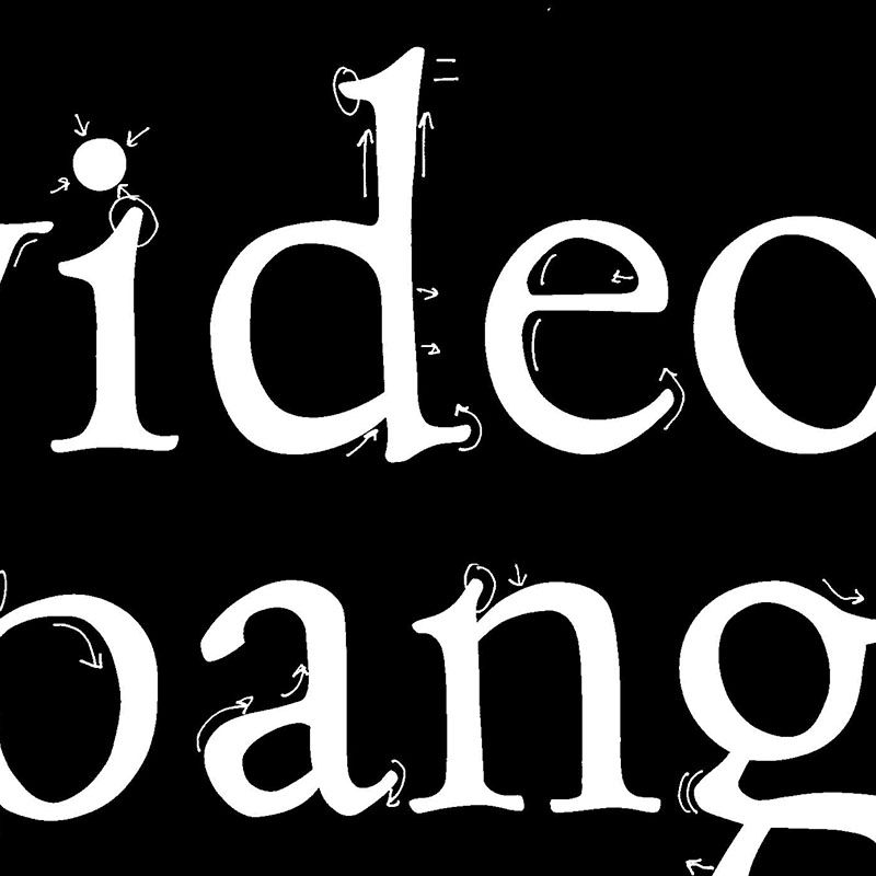
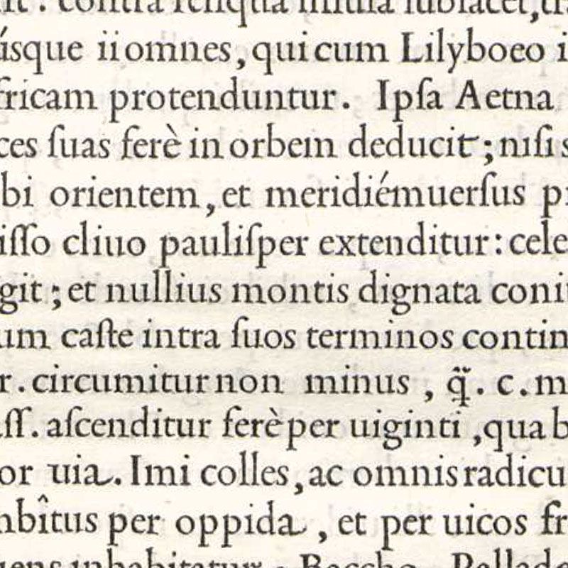
We shall look at the Roman type engraved by Francesco Griffo for Pietro Bembo’s De Aetna which was printed by Aldus Manutius in Venice in 1496. We shall try to understand the details and structure of that type and how it can be interpreted to make modern letterforms (Roman, sans serif and other styles). This will be done with with a 3B pencil – an ideal tool for understanding historical Roman type. The starting point for our work will be blown-up photos of the original De Aetna type.
P2 Word Project
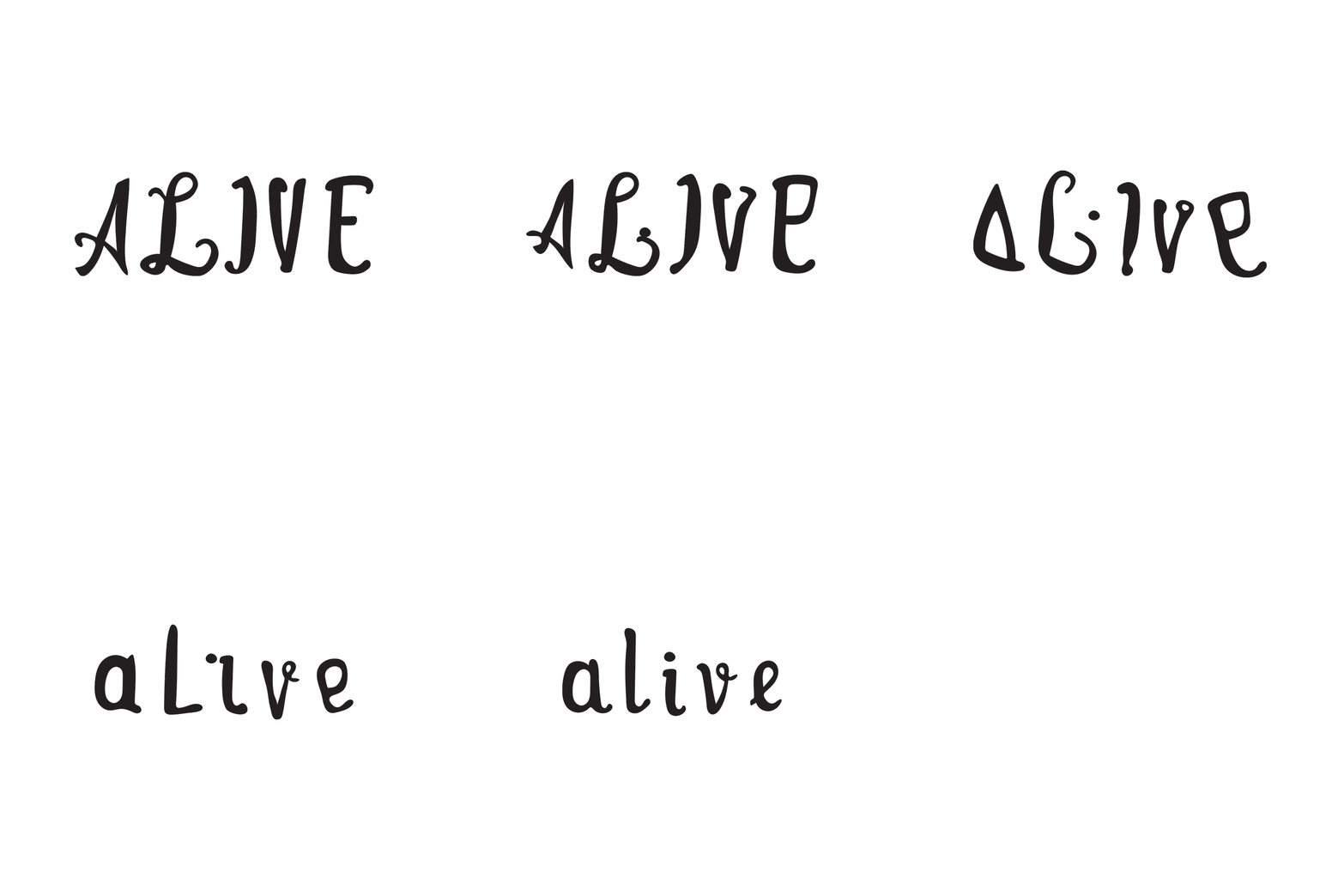
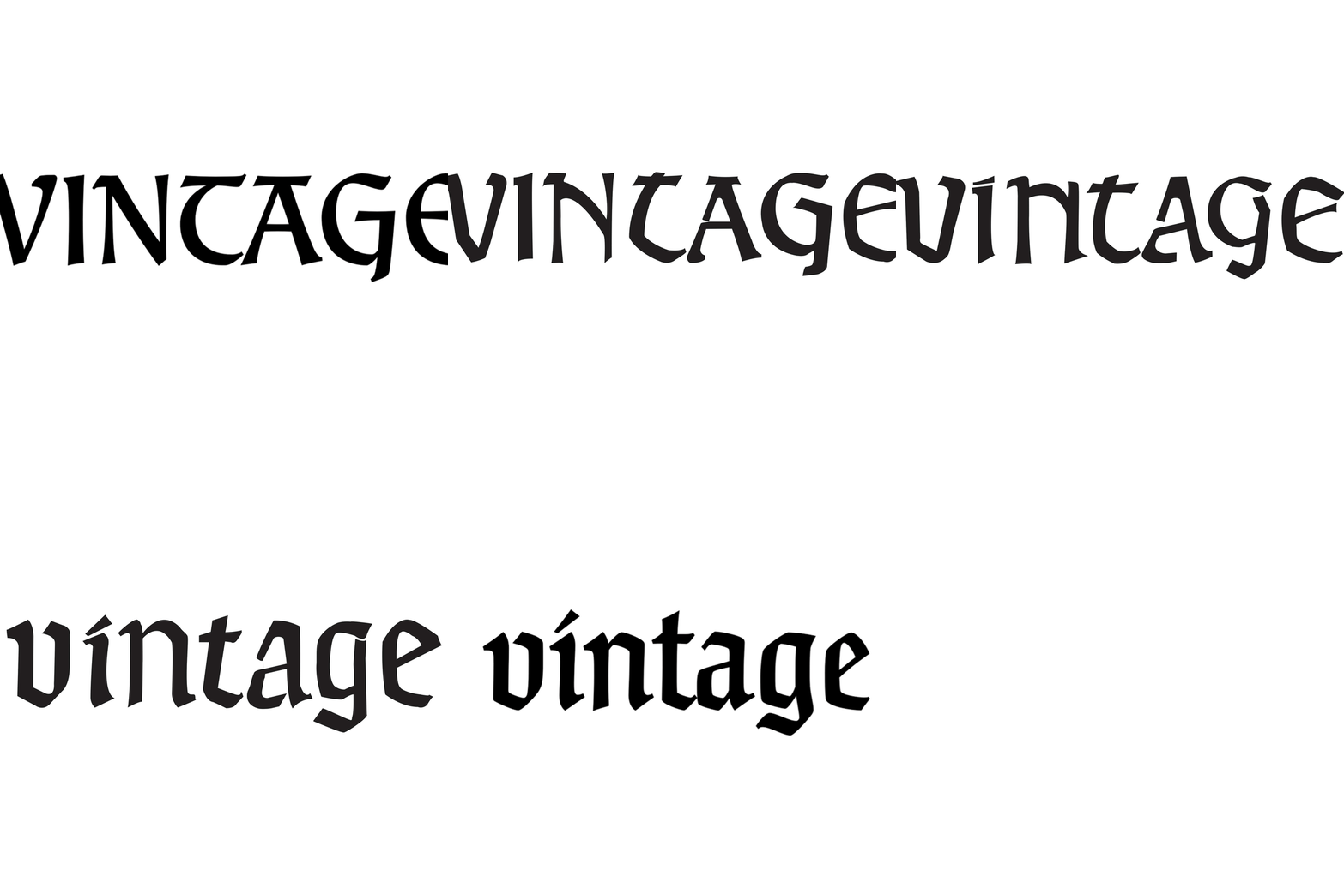
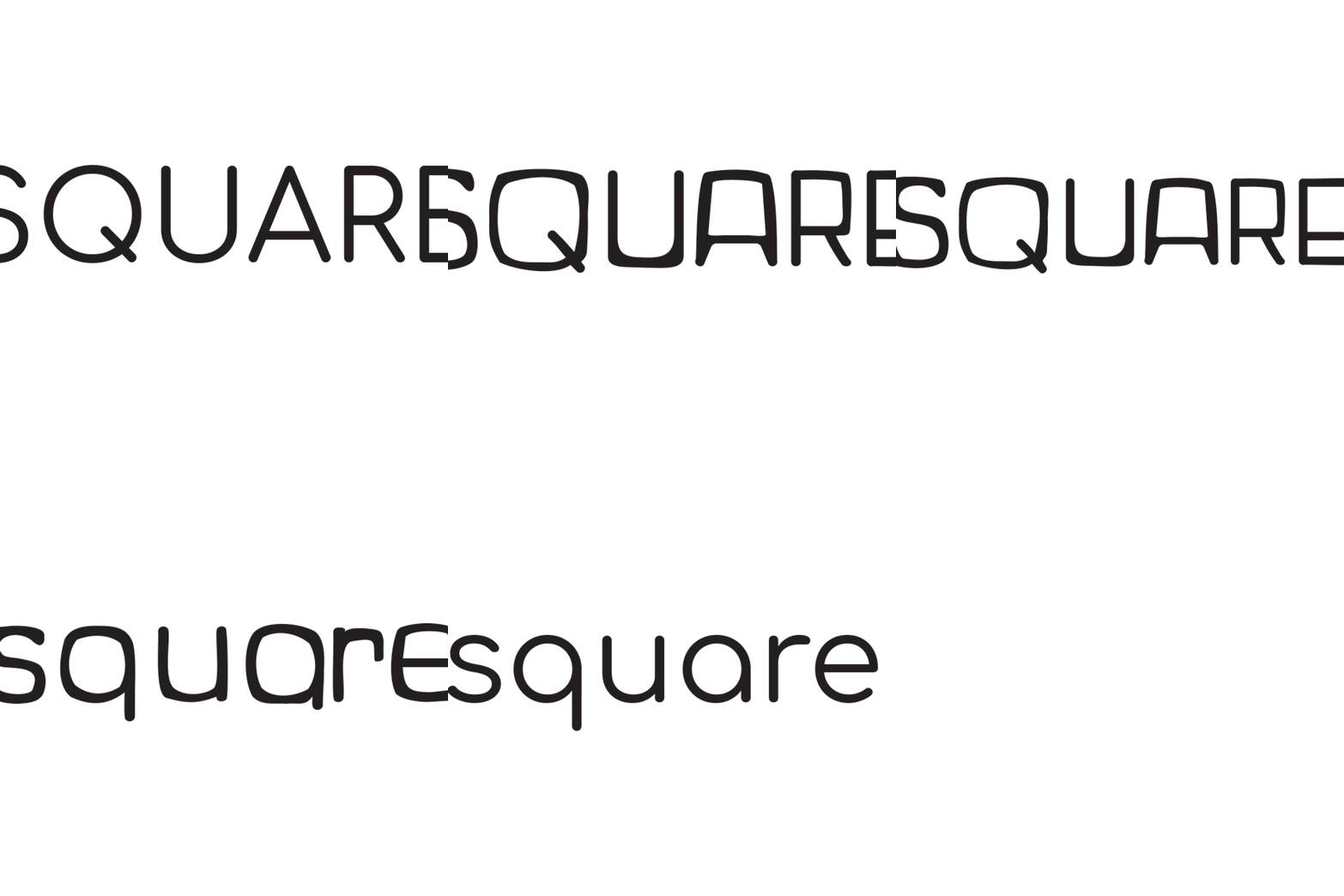
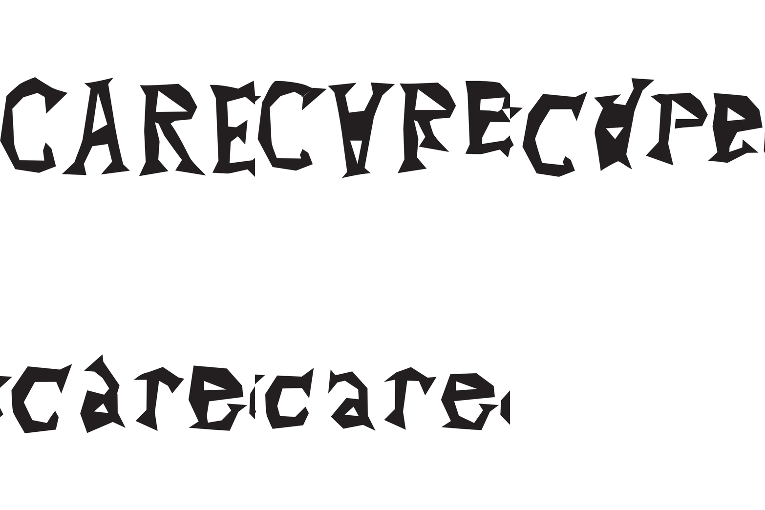
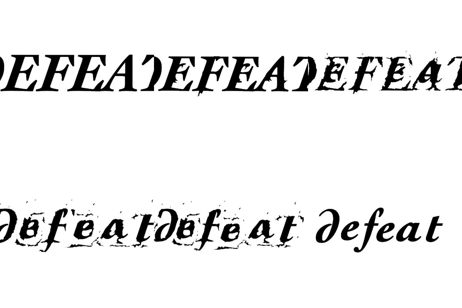
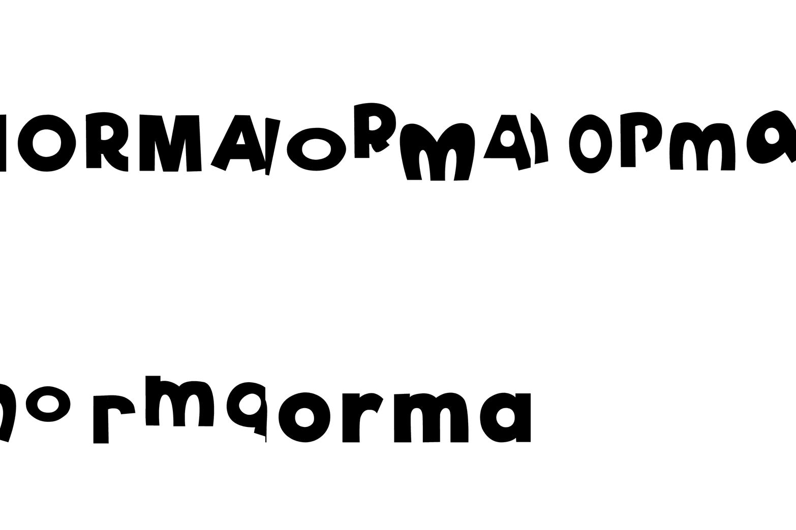
We shall look for two opposing words and create a 5-step animation for each word, a transformation from uppercase to lowercase. The starting point or model for drawing will be a specifically researched alphabet — a typeface that features qualities related to the meaning of the chosen words.
P3 Paragraph Project
We shall measure types and text frames in an early printed book, and illustrate the metrics behind the words arranged in a specific page architecture. For our study, we will use a spread page from Pietro Bembo’s De Aetna, printed by Aldus Manutius in Venice in 1496. Measuring will be done both digitally and with a pica ruler or type gauge. The end result will be a 17"×11" research poster.
P4 Specimen Project
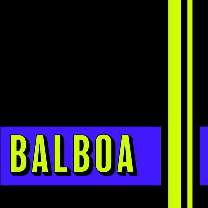
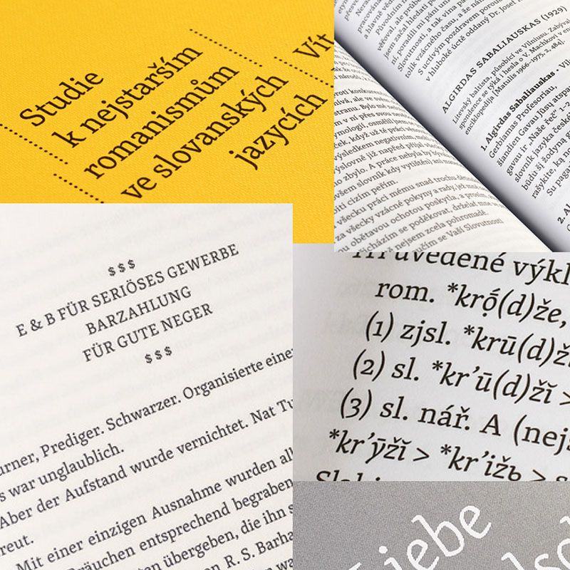
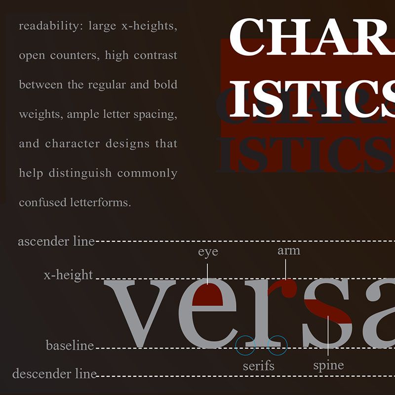
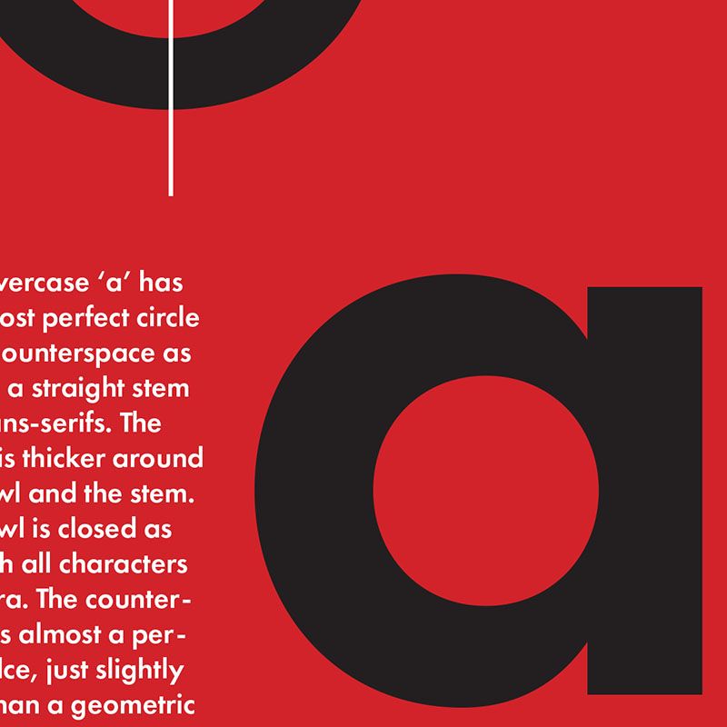
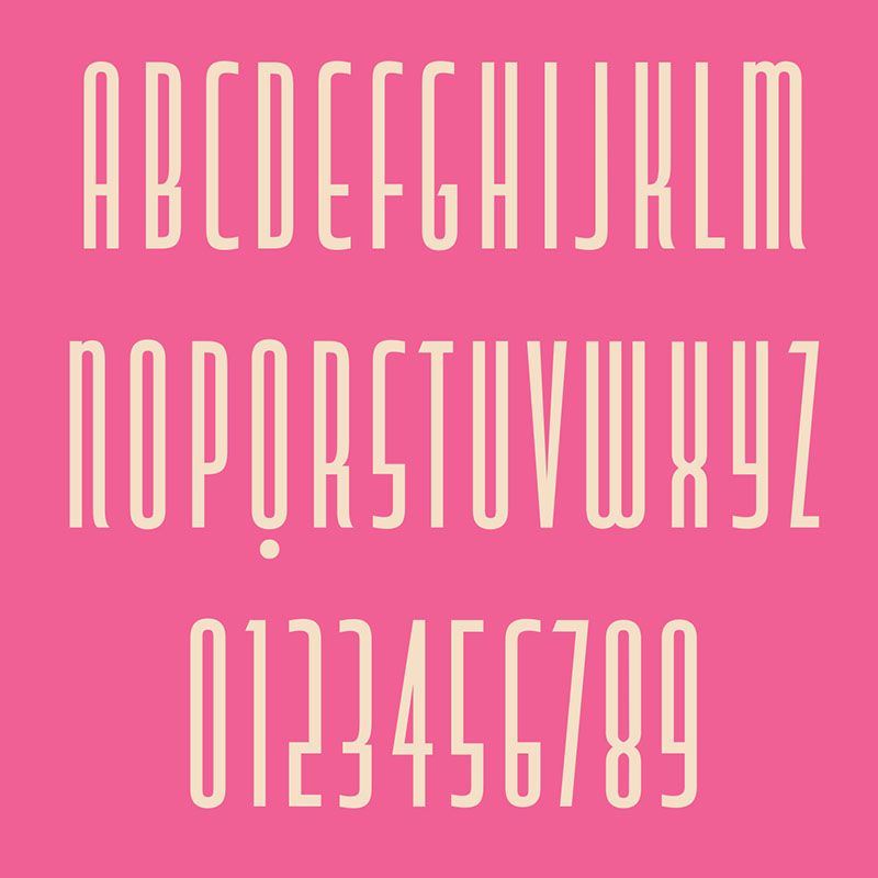
We shall explore type specimens as a relevant form of commercial art, cultural and historical research. Design & typeset a 28-page specimen booklet (cover included) for one of the Adobe Fonts (https://fonts.adobe.com). Discuss the typeface family choice. Peruse both the student and industry exmaple provided.
