Intro to Graphic Design Software I
Projects
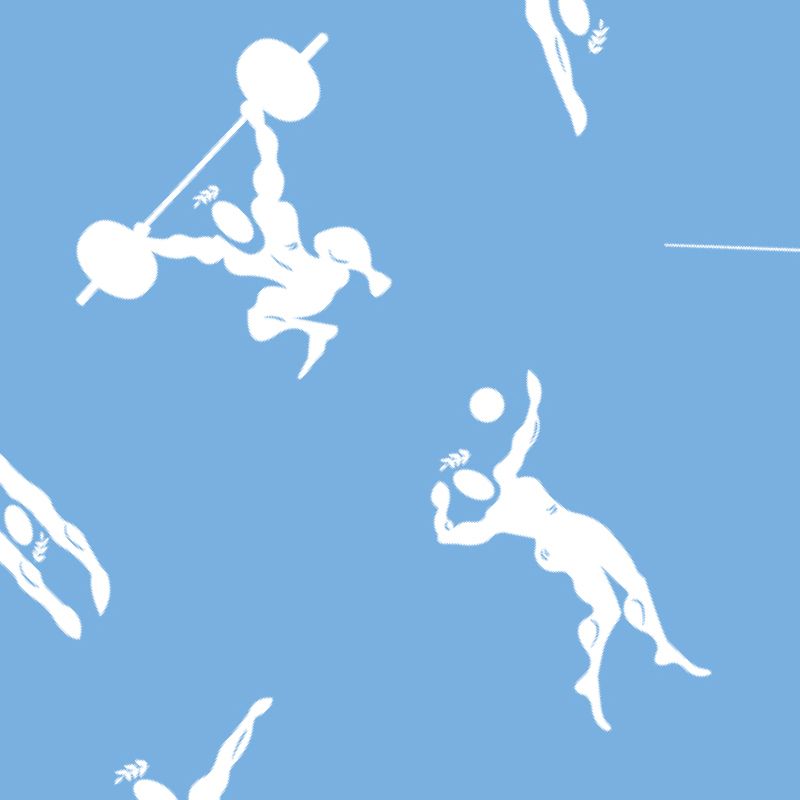
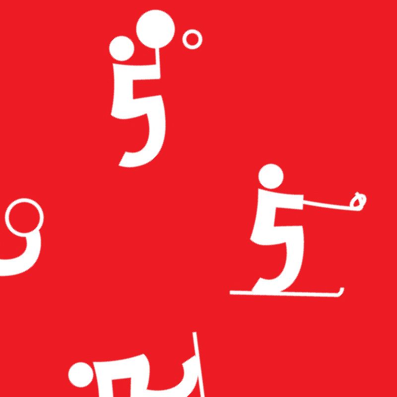
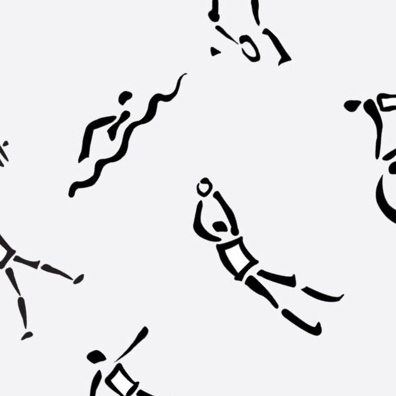
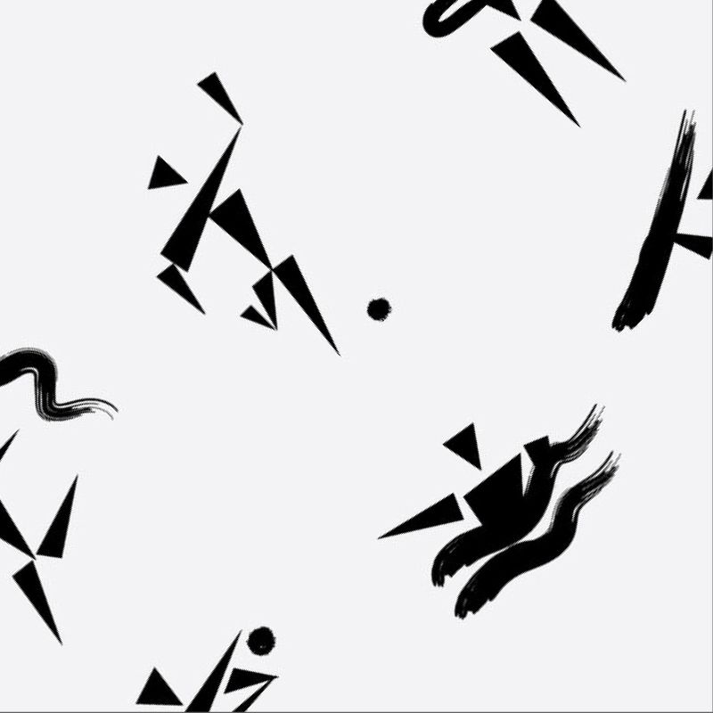
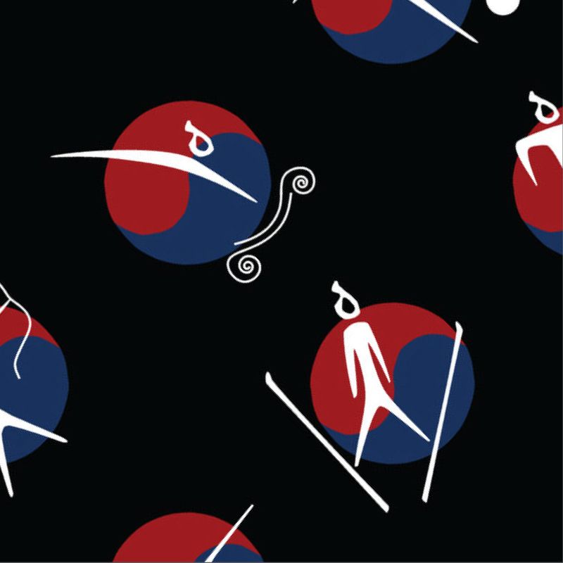
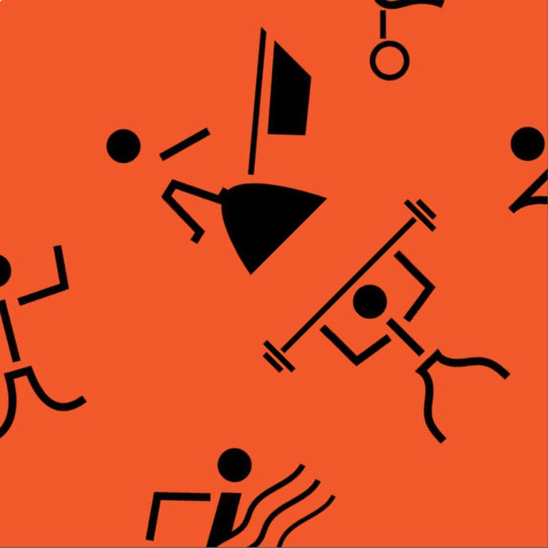
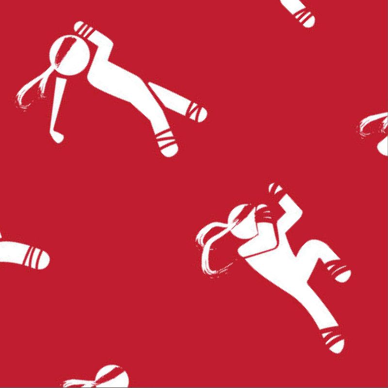
Summer Olympic Pictograms
Students were asked to design six identical signs that use physical “links,” in order to communicate six sport competition events at a summer Olympic Games. In addition to communicating the sport competition events, the signs that you will come up with, need to have a distinct style that communicates the host country of the Olympic Games. The chosen style teaches the audience something about the culture and history of the host country.
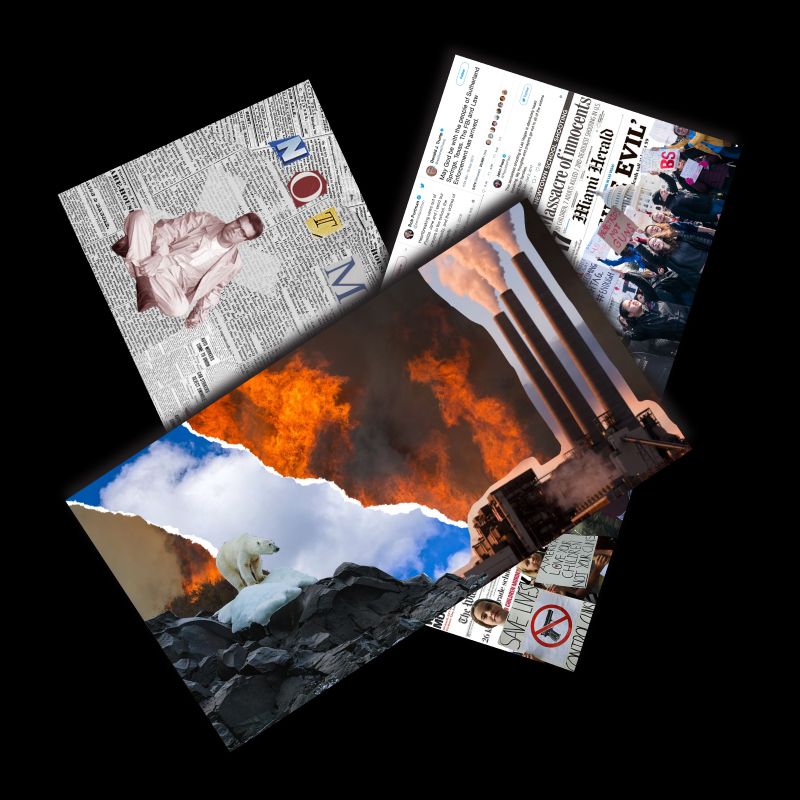
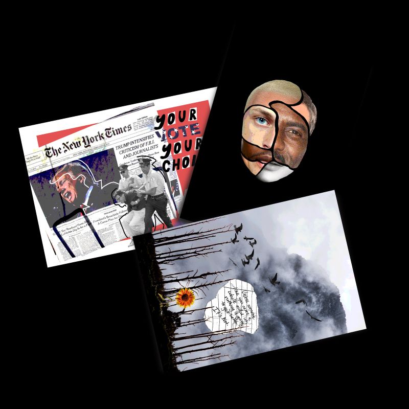
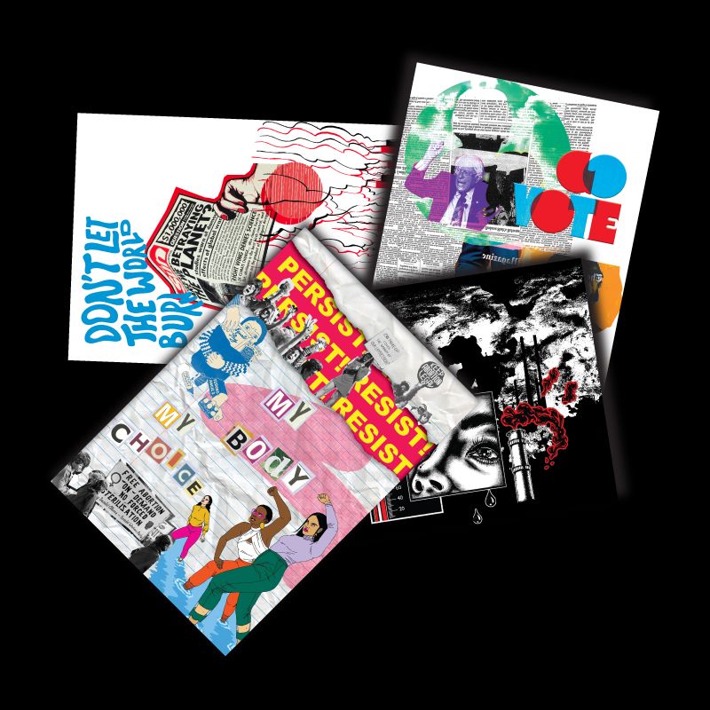
Postcards from Binghamton
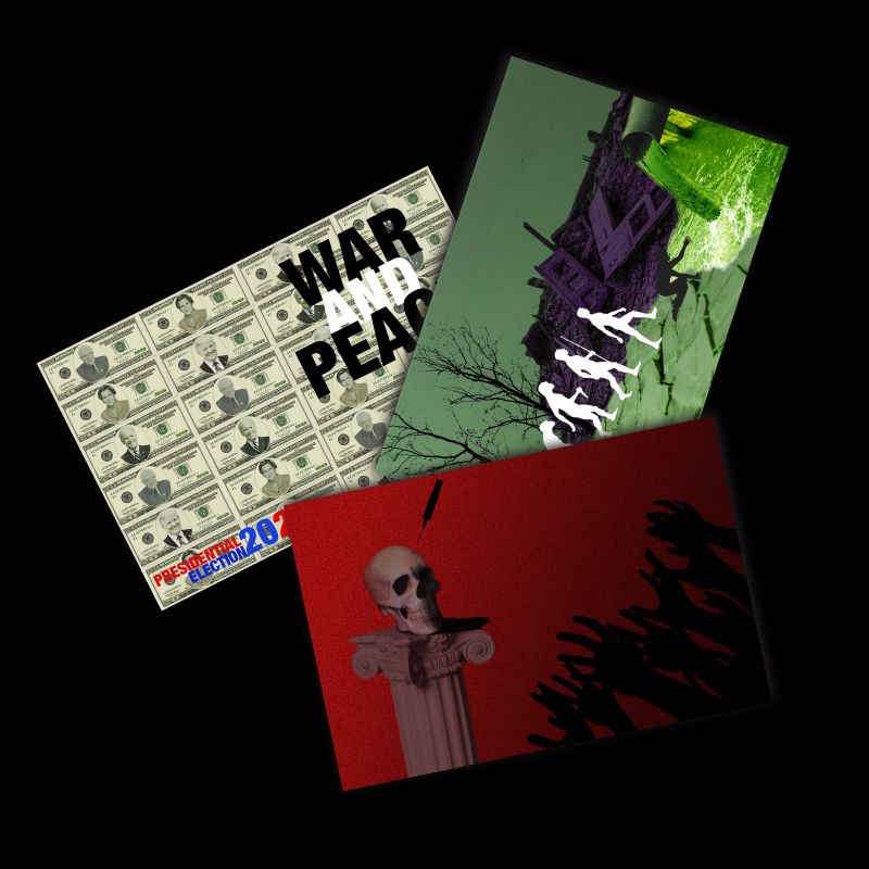
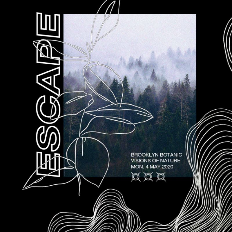
This assignment revolved around the idea of collage and its processes, and students had to utilize Adobe Photoshop in order to create a series of digital collages in the form of three unique postcards. The dimensions of the postcards could be 5.5 x 8 inches, or 6 x 11 inches. Students could decide to incorporate both sizes.
Every postcard had a specific theme, touching on current economical, political and/or social issues.
While working on the assignment, students were encouraged to think of how other elements – besides just found images on the web – might be utilized into their collages. Students could scan surfaces, and/or objects and use that in their work. Students could write or draw elements, scan them and also bring those into their work.
Restrictions
* [...] RESTRICTIONS, someone said that design is always the product of a lot of restrictions – Charles Eames I think, or maybe it was Charlie Chaplin – but that's exactly how it is. You can't overstate the role played by restrictions. But not only the ones that come with the job, I mean the given ones, the content, the budget, the time, your own limits, even the expectations of the client or whoever you're working with. They all restrict you. But I think you have to then introduce a set of extra restrictions based on these, that in a way protect you from them. I think it's here that you in fact find all the decisions you need. The size, the format, whether to use colour or only black and white, whether to use images and type or just type.
It's a way of setting up rules to the game you're about to play.
Rules that create the game.
And the clearer the rules the more fun it is in fact to play. [...]
* From Dot Dot Dot 12, page 69
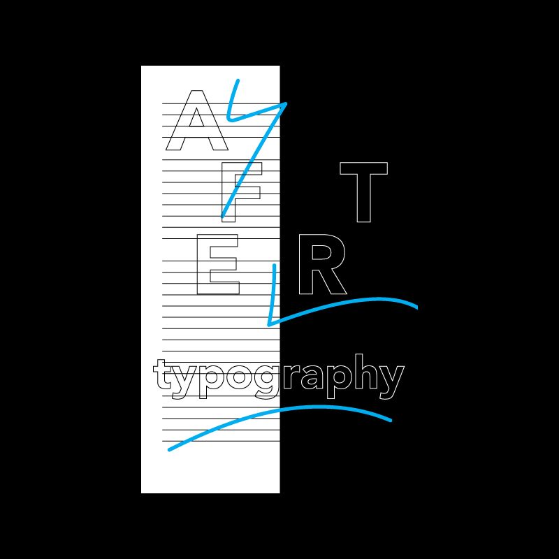
Assignment asked students to pair up with a partner in class and come up with a series of 10 rules for how you will make an 11”×17” poster. The only content permitted on this poster are the rules themselves or the result of following them. The rules could be highly specific or more open to interpretation. Students had to exchange rules with their partner and create a poster based on each others rules.
Links
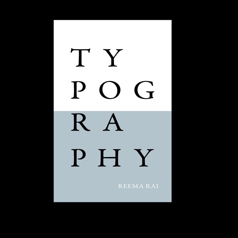
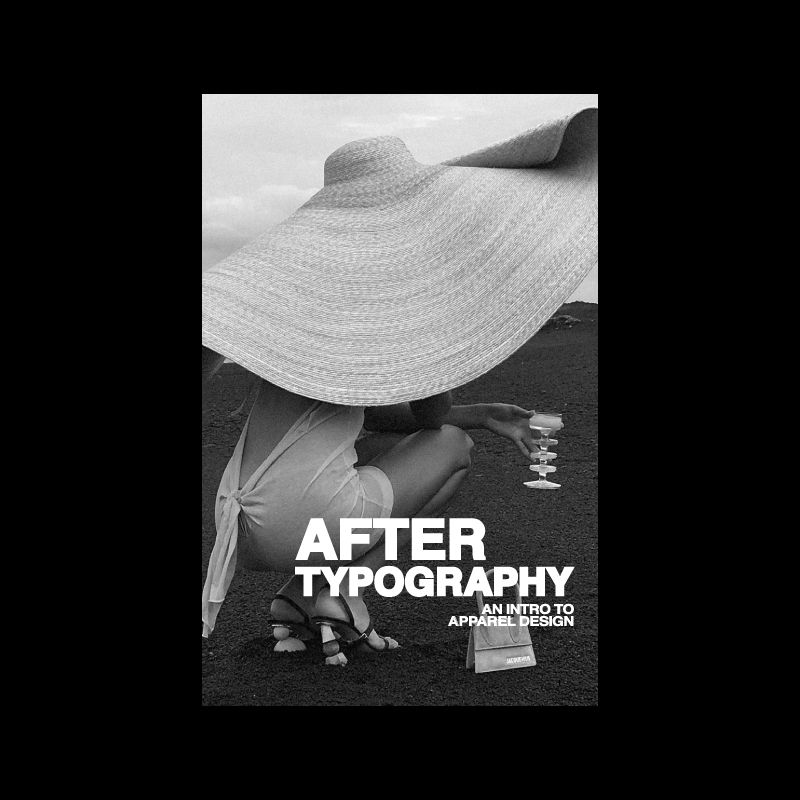
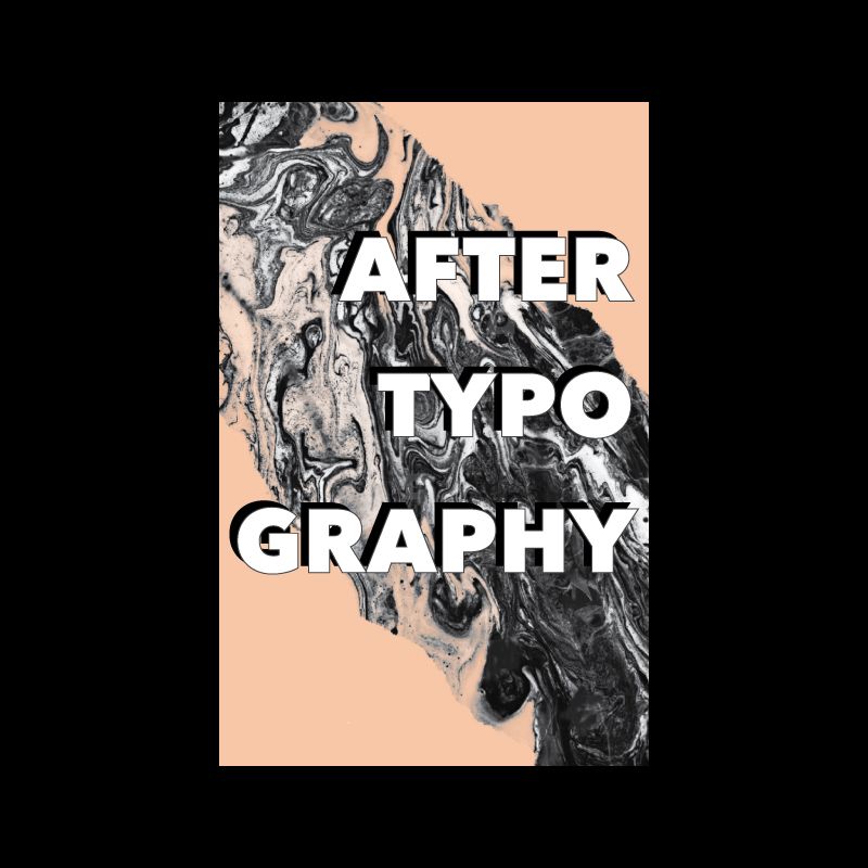
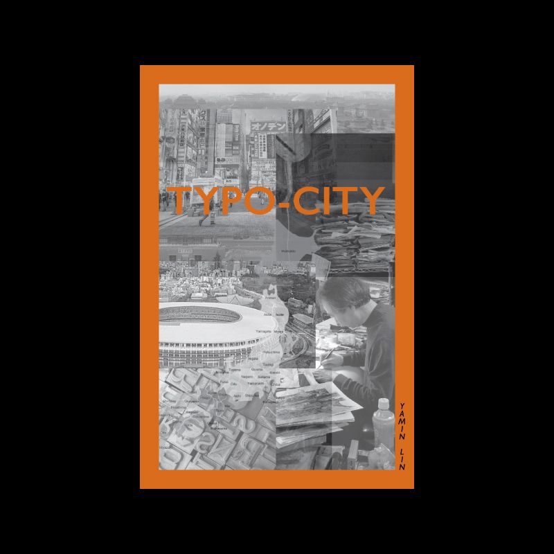
Students were asked to create a 5.5x8.5 inch book in an attempt to explore InDesign tools, techiques and ways of workflow. Software was introduced to them through earlier class exercises, and now students had the opportunity creating a small book by pulling tools and techiques using Adobe InDesign, Adobe Photoshop and Adobe Illustrator software.
The content of the book consists of ten links from wikipedia entries. All students had to begin from the same wikipedia link entry of Typography, and were allowed to create their own content and narrative by using nine more linked wikipedia entries. Project required student to create a grid/system for the book, choose a font, choose a single color, and create style guides for all differetn typographic elements.
