Graphic Design I
Projects
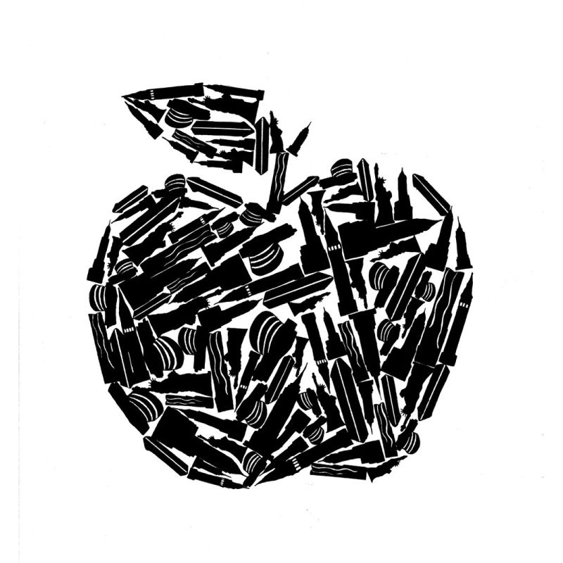
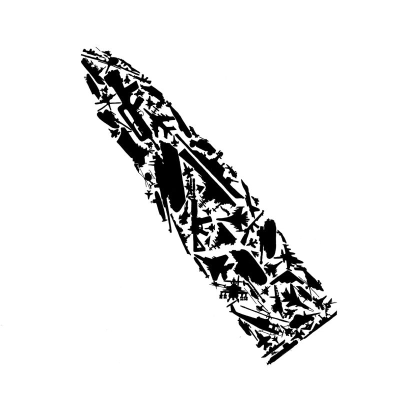
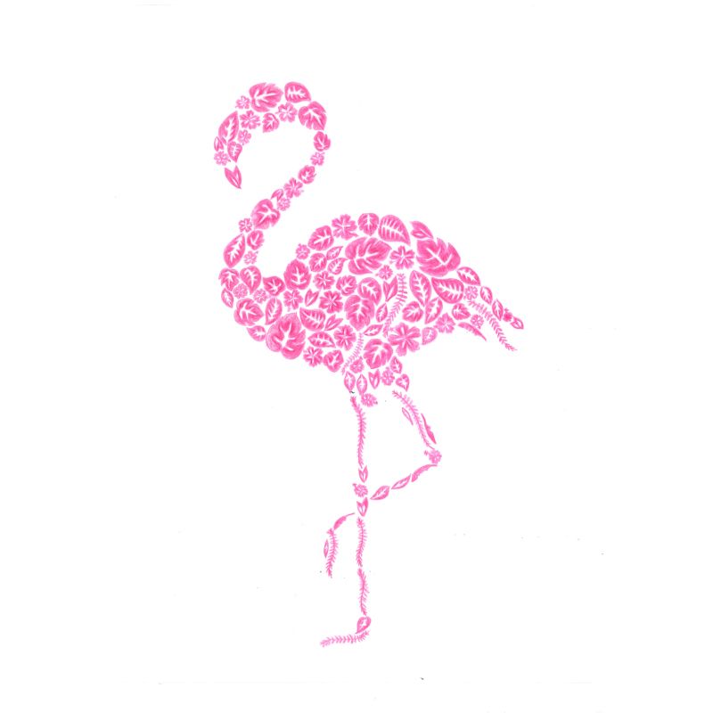
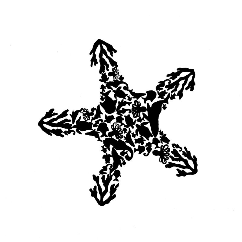
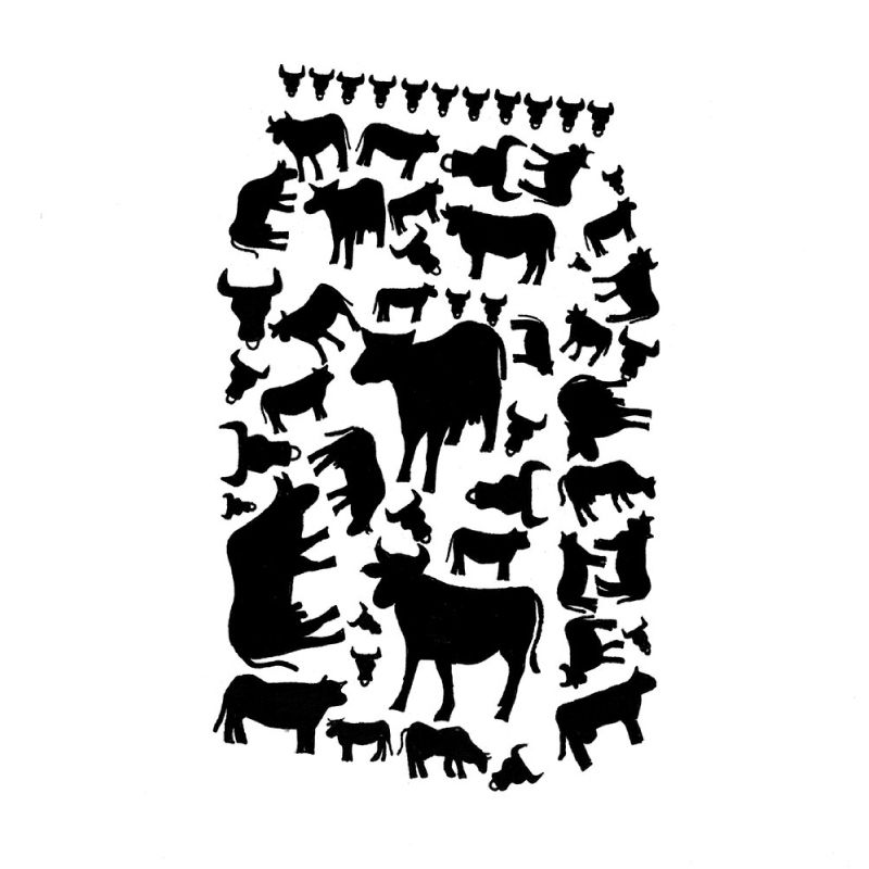
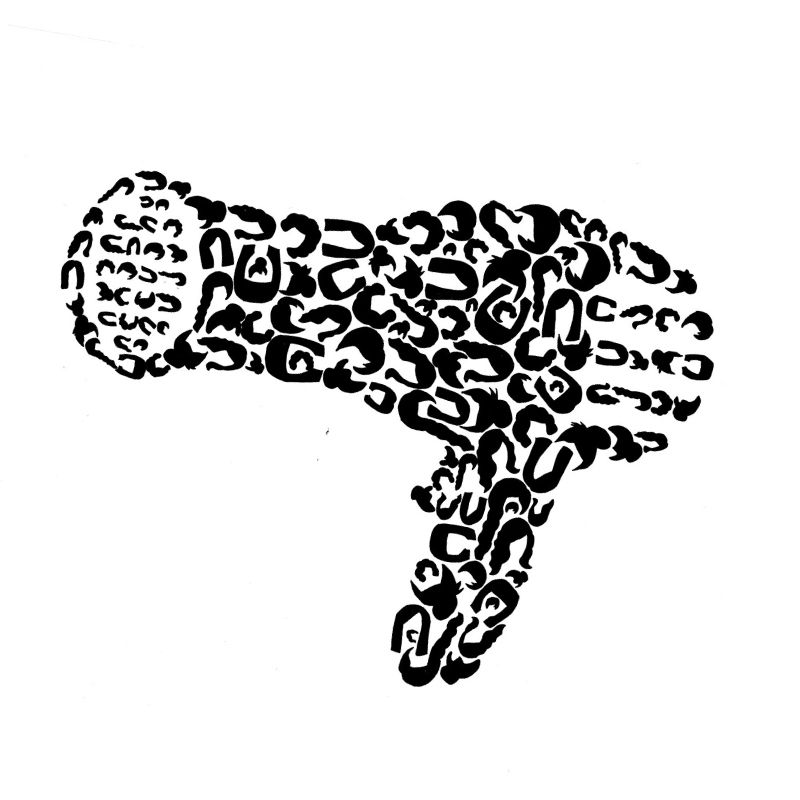
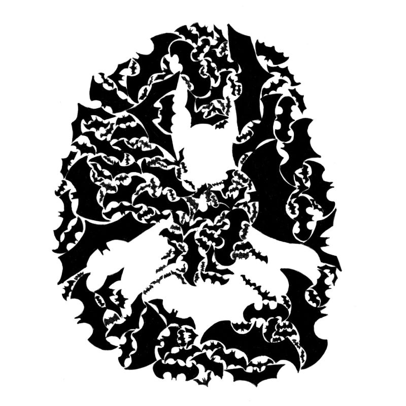
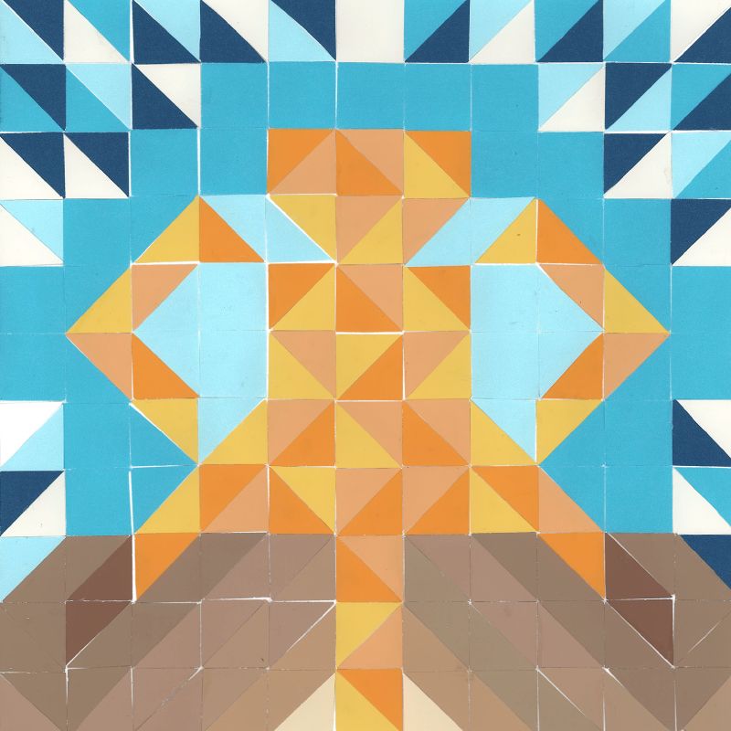
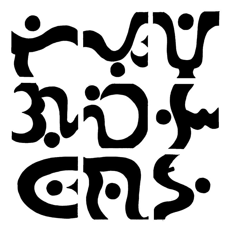
Big from Small
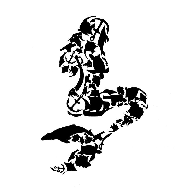
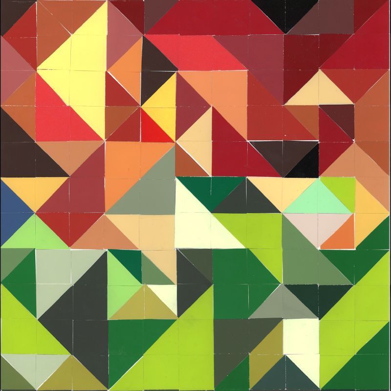
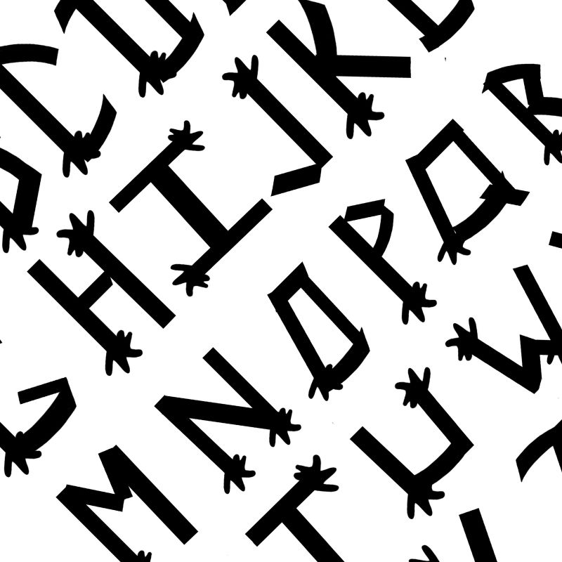
Students were asked to choose a group of elements that are somewhat related, and start creating small silhouettes of them. Students could later repeat and arrange these small silhouettes in such a way that was going to allow them to create a bigger picture with the representing object being somewhat related to the smaller ones.
All works are created without using the computer. Students were encouraged to use tracing and paste up techniques as well as incorporating analog methodologies.
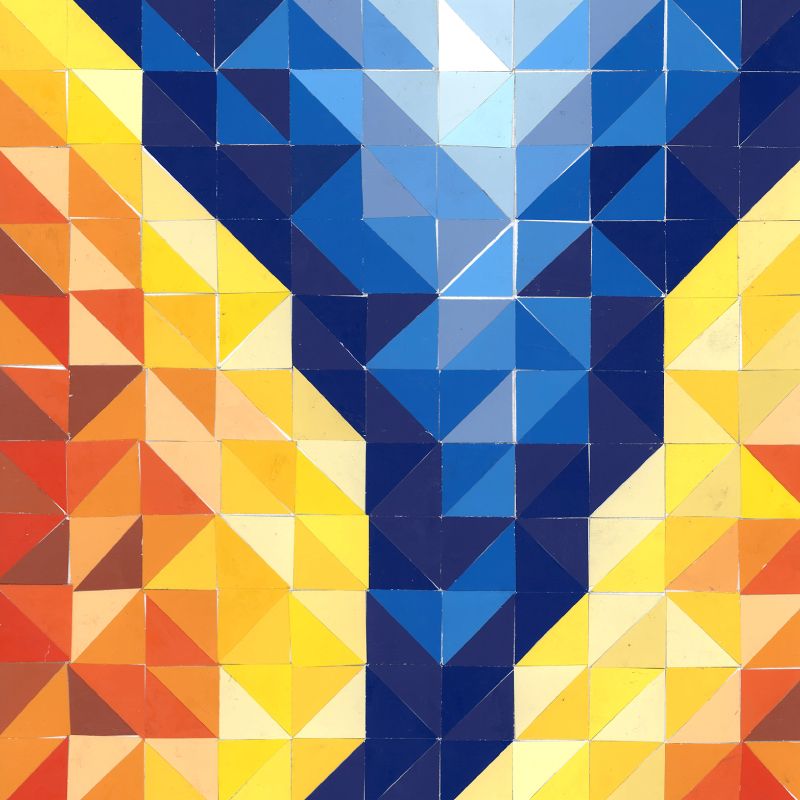
3 Book Covers for Dr. Jekyll and Mr. Hyde
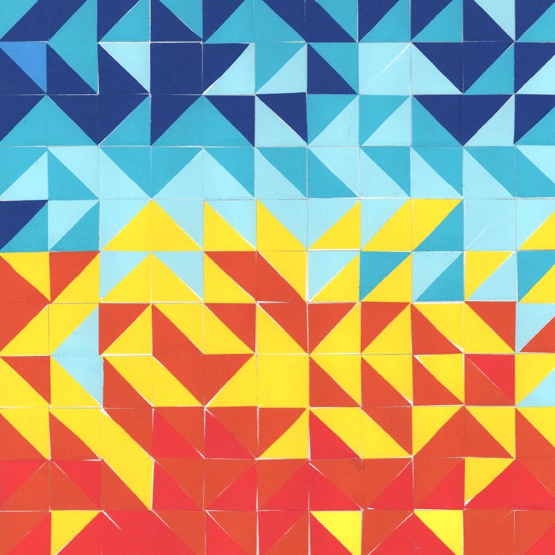
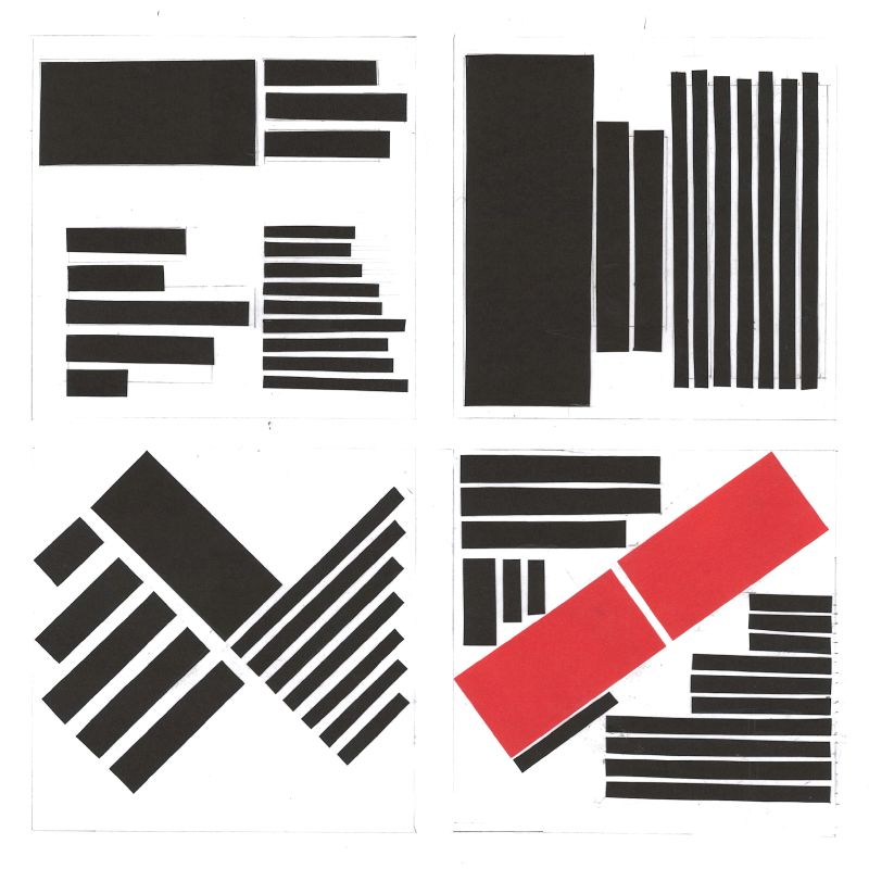
The students task was to design three book covers for Robert Louis Stevenson’s Novel “Dr. Jekyll and Mr. Hyde.” All students had to work within the limitations of a specific grid template prepared for this assignment.
At least one of the following contrasts had to be present in each composition:
– Contrast of saturation
– Contrast in value (light and dark)
– Contrast of hue
– Complementary contrast
– Warm/cold contrast
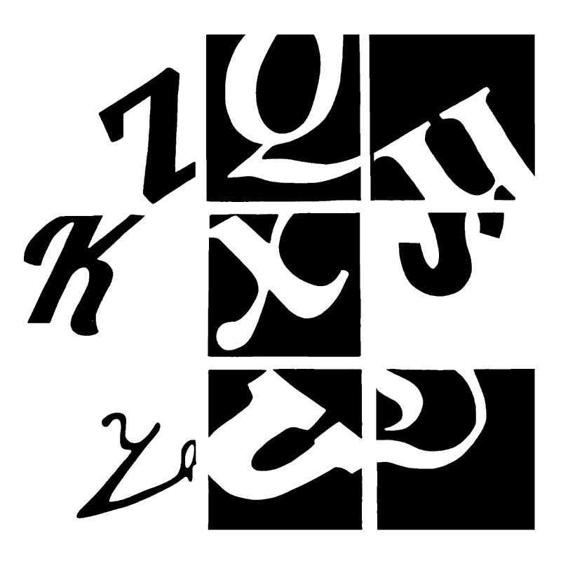
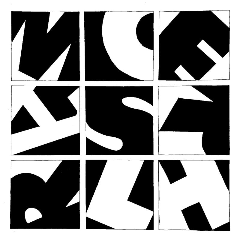
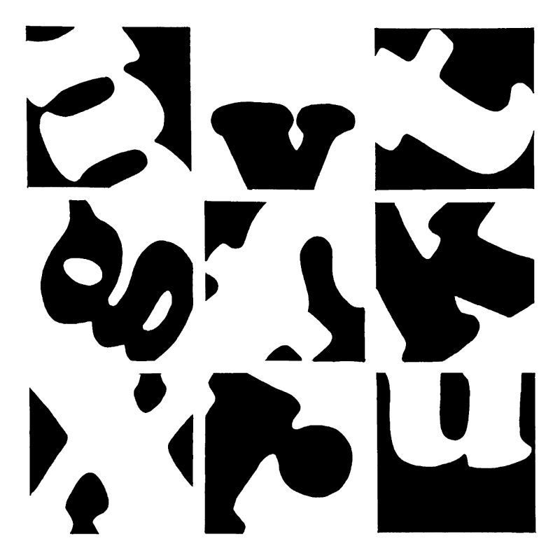
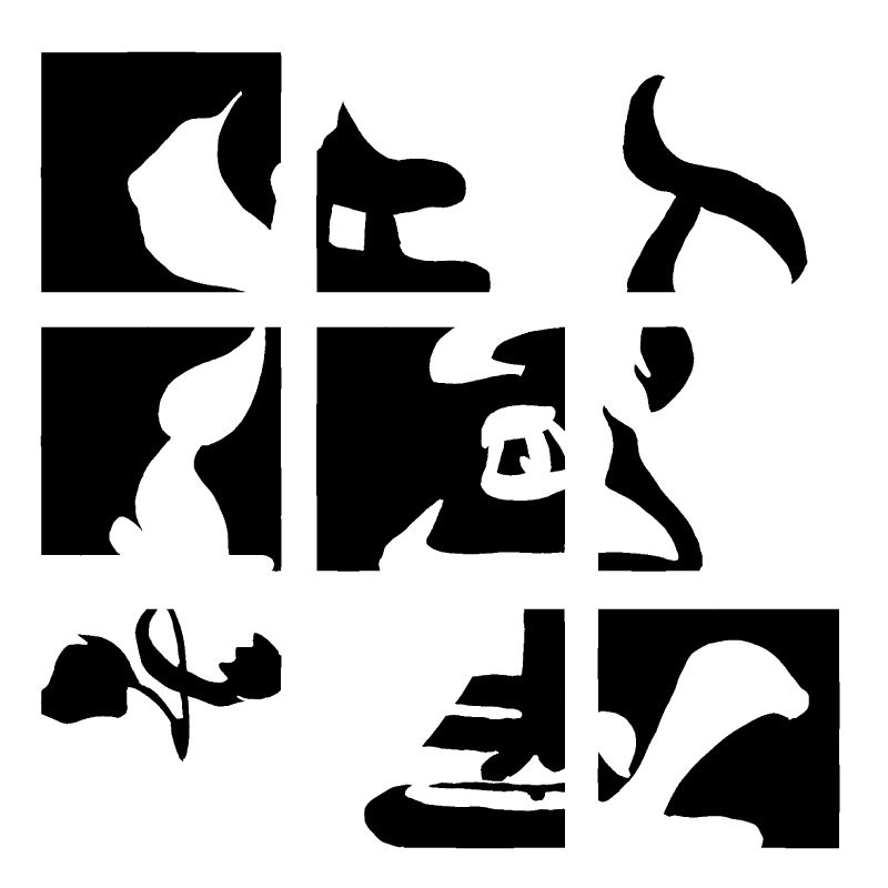
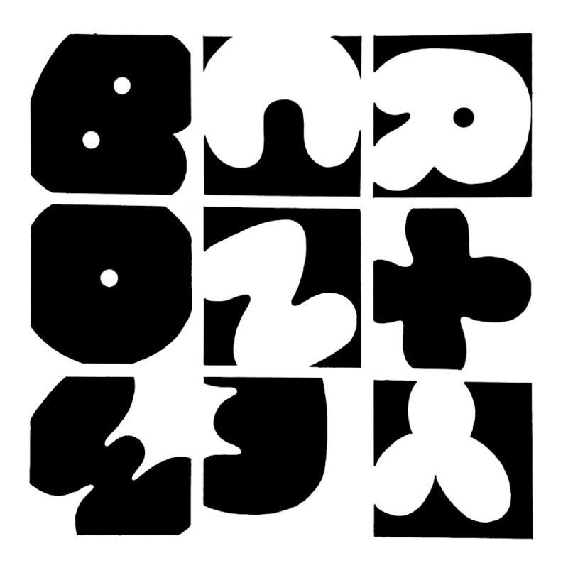
Figure and Ground in Typography
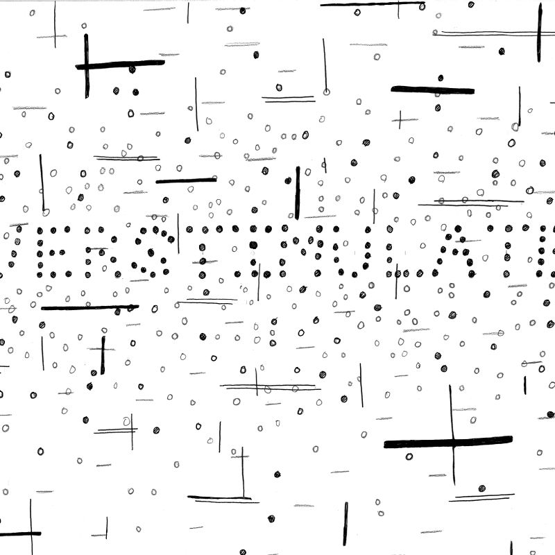
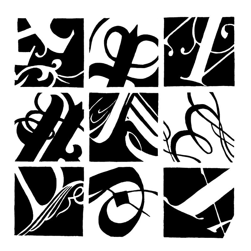
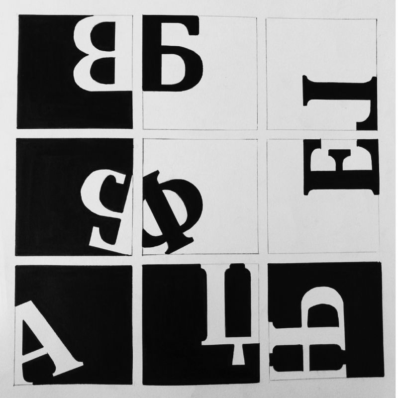
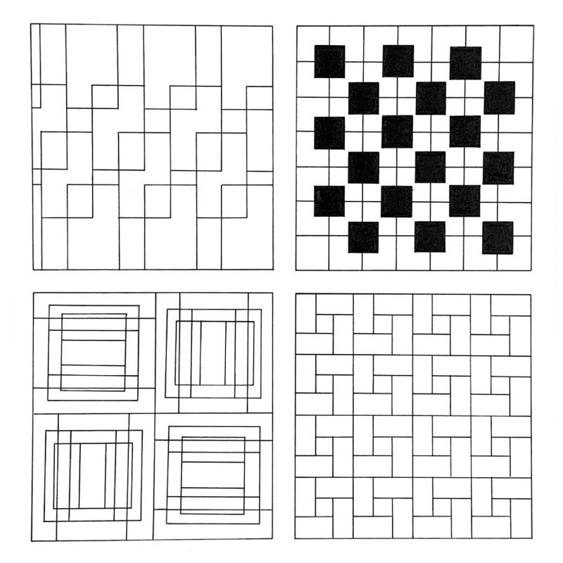
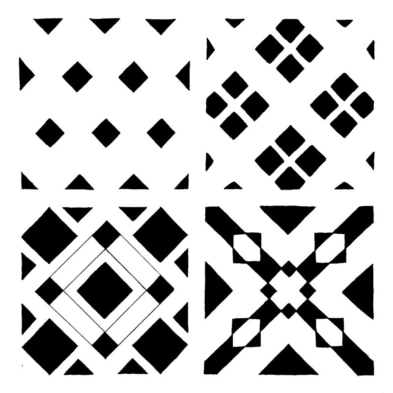
By consulting the assignment template provided, students had to create 9 precise identical squares in three rows and three columns. Each square should be exactly 3” x 3.”
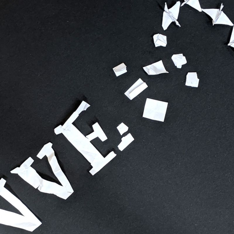
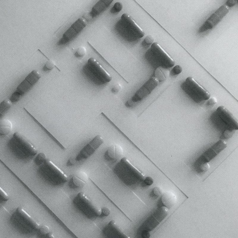
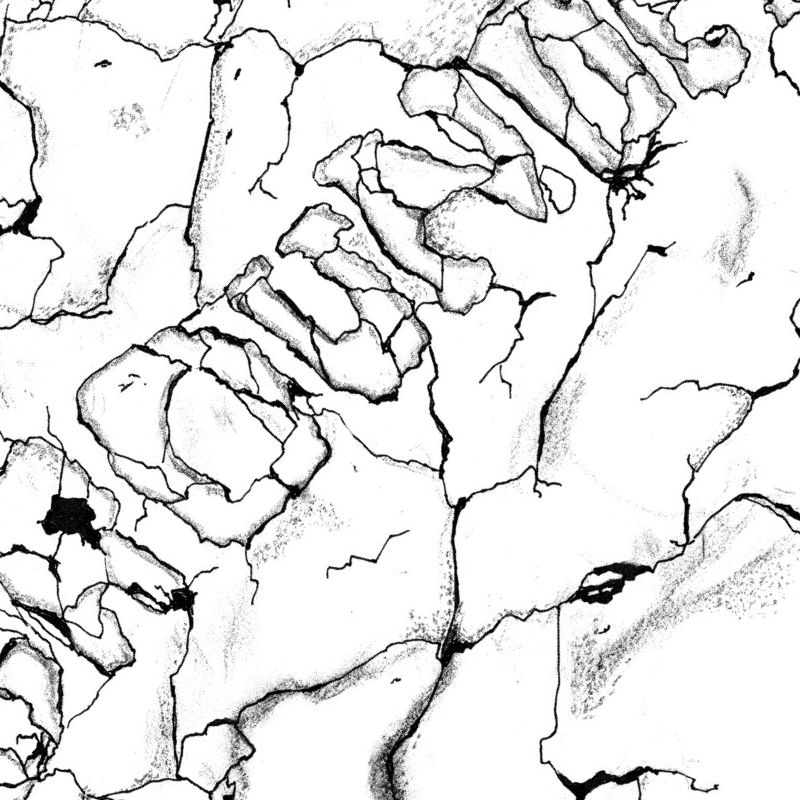
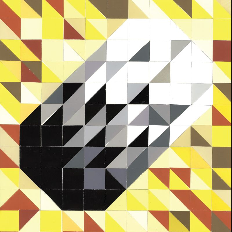
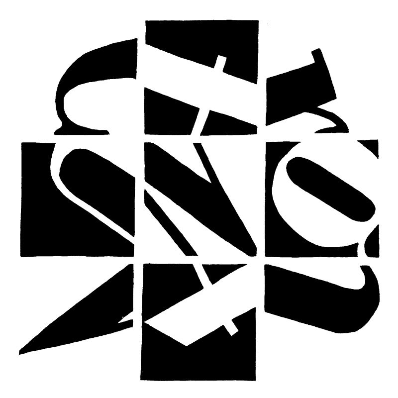
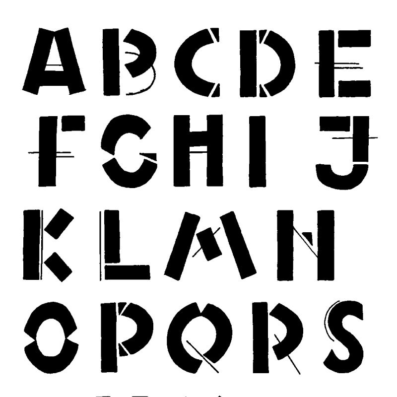
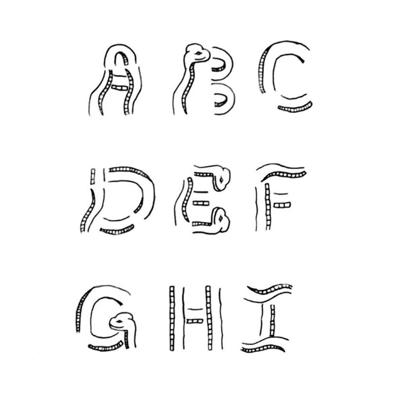
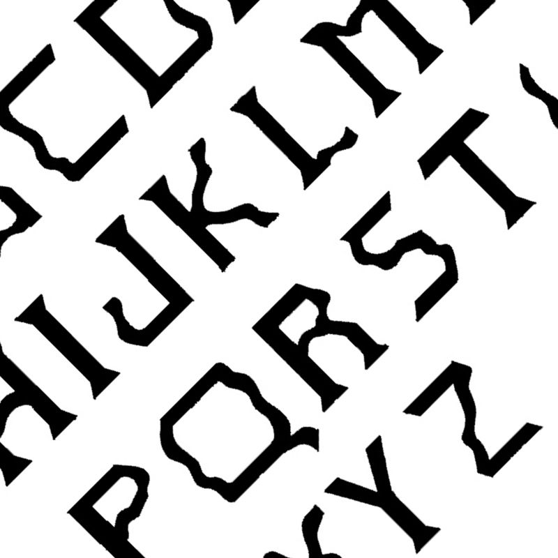
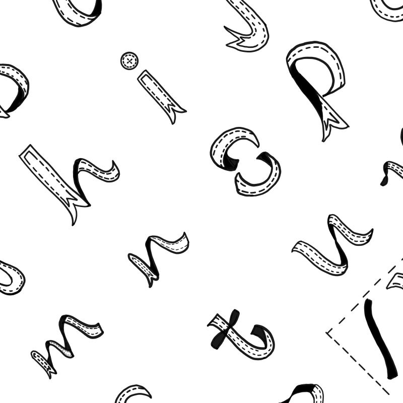
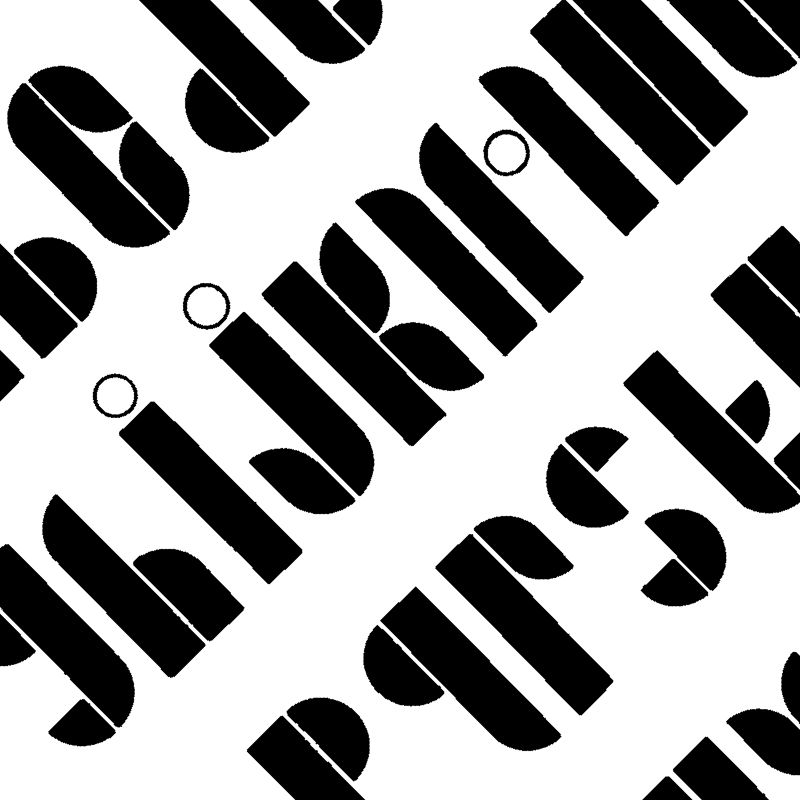
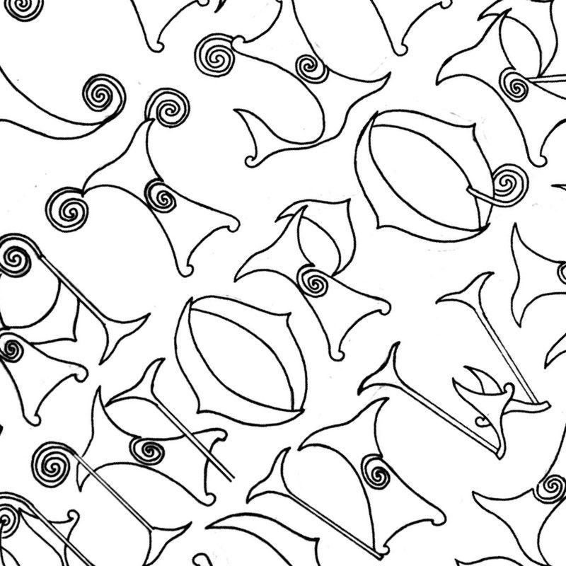
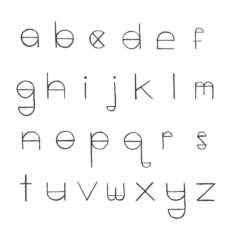
Inside each square. students had to create interesting black and white (figure/ground) relationship between leterforms and the negative space. Students could draw leterforms sometimes in black and sometimes in white. Students could consider drawing a hint of each letter identity and not the whole letter. Students were strongly encouraged to attempt to make individual squares designs integral part of the whole composition consisting of nine identical areas (squares). This could be achieved by manipulating leterforms and shapes (both positive and negative) inside of the individual squares giving special attention to the edges of the square area. Students had to think of the individual square edges as a continuation or extension (flow) to the next square area.
* All work is created without using the computer or software. Emphasis have been given to the analog processes and techniques.
Hierarchy
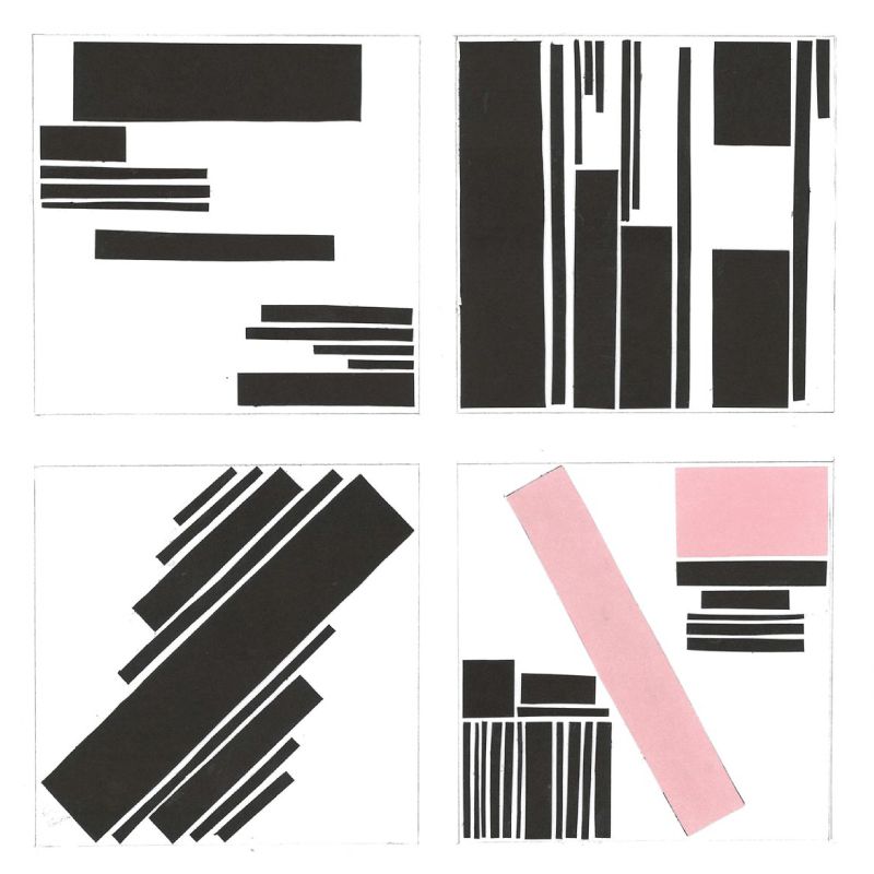
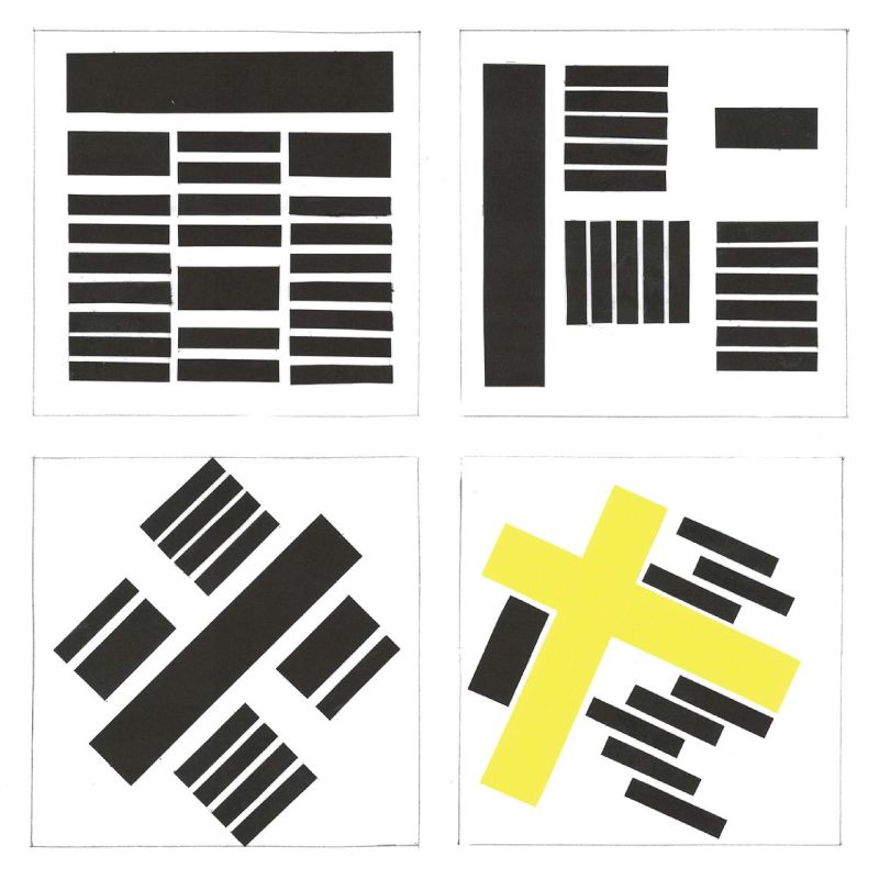
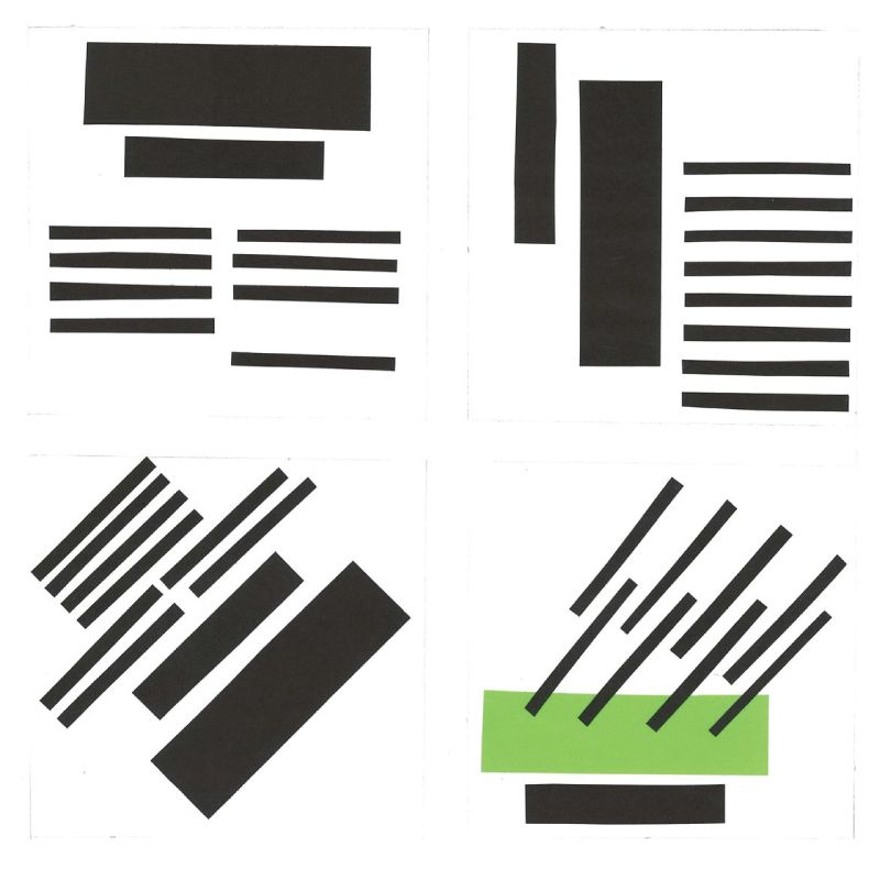
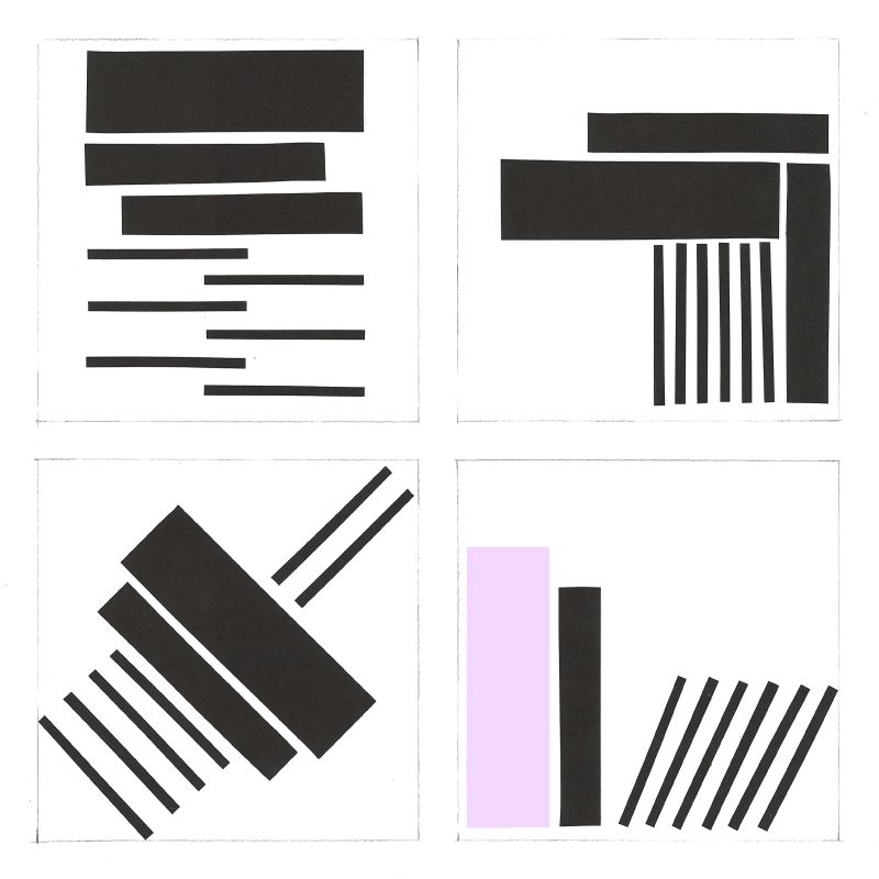
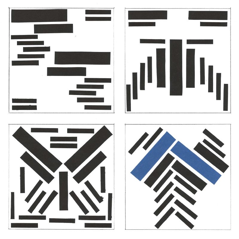
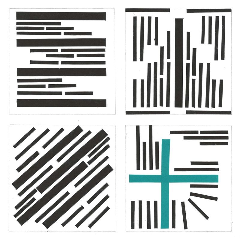
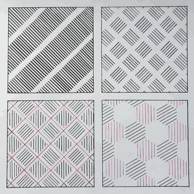
This exercise was intended to familiarize students with the concepts of typographic hierarchy and layout – in an abstract way – without the use of typesetting software or any type at all. The various thicknesses and lengths of the lines represent the text (Title, subtittle and main copy). Students were invited to create interesting visual hierarchy in each one of the squares, while experimenting with spacing and position (layout).
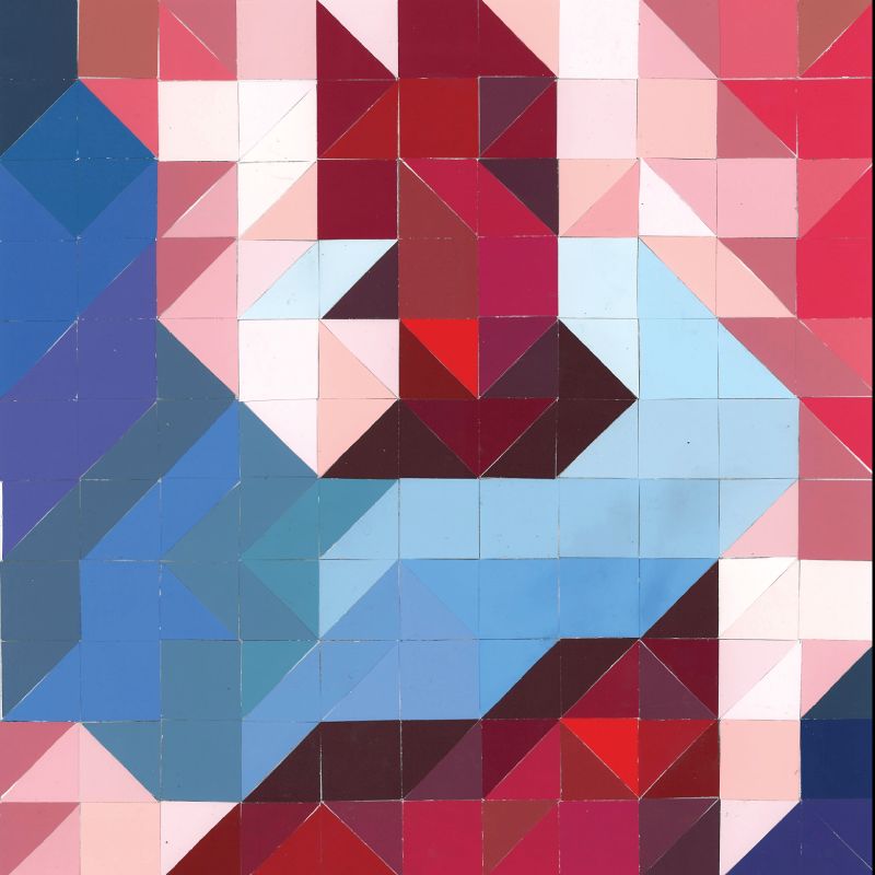
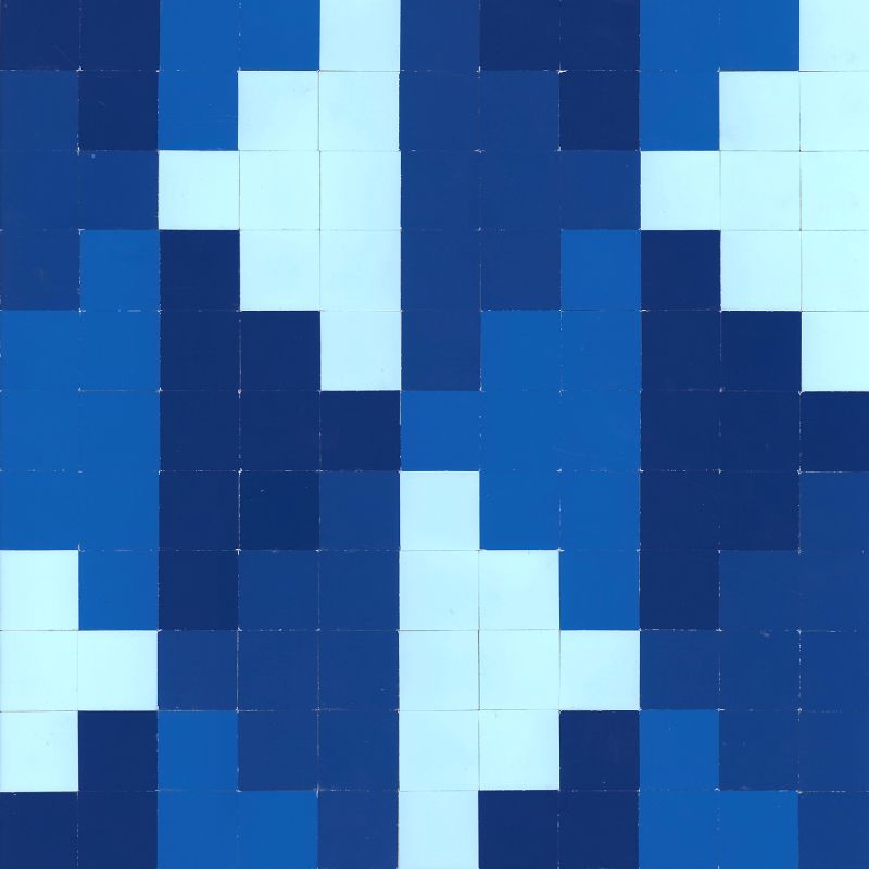
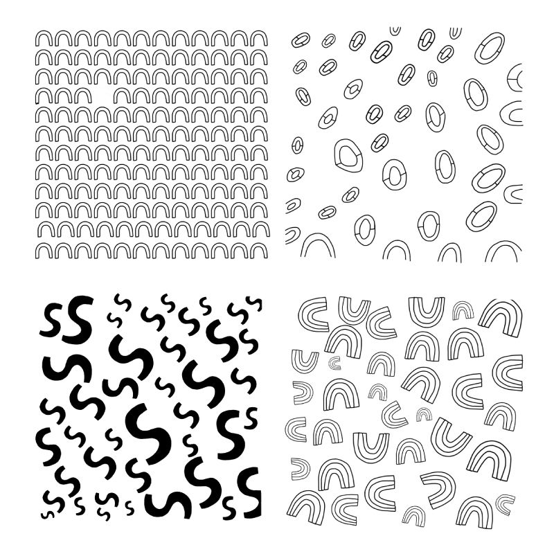
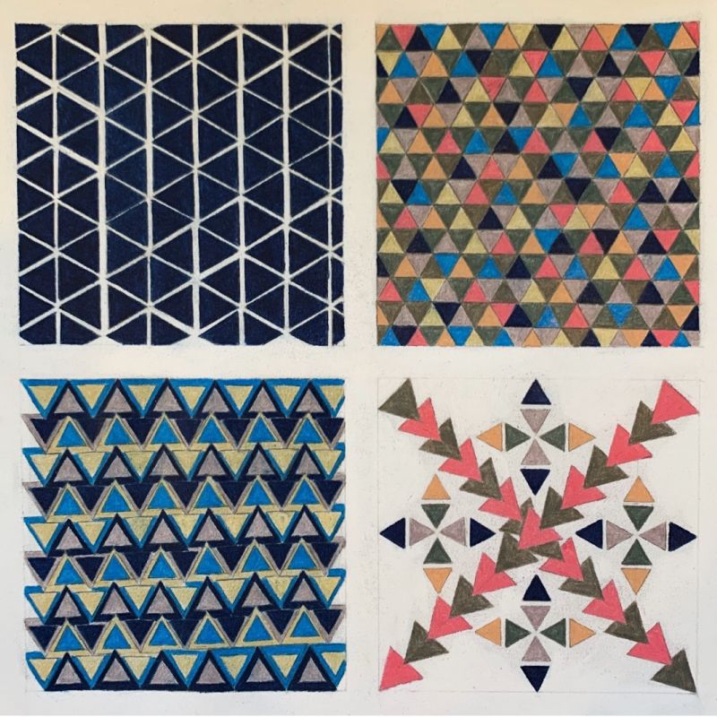
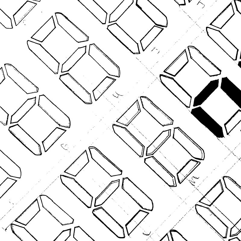
One Element, Many Patterns
Devise a single element, such as a dot, diamond, squiggle, or square. Copy and repeat the element in columns or rows to make an overall pattern. Vary the spacing of the elements in the rows to create variation. Continue to create new variations by varying the size of the elements, by creating overlapping rows of elements, and changing the color, size, and orientation of elements.
